
You know that feeling when you finally find the mudroom entryway that looks *exactly* right for your space? That little thrill of “Yes, that’s the one!” is what this guide is all about. We filtered through hundreds of options across IKEA, Target, and even thrift store finds to bring you ideas that actually deliver. We’re talking about real, functional, and beautiful entryways that make coming home feel like a sigh of relief. Inside, you’ll find 28 curated ideas covering everything from Modern Farmhouse to Scandi Minimalist.
These aren’t just pretty pictures; we’re giving you designer tips, budget breakdowns, and honest advice for each one. And stay until the end — we break down the most common mistakes that can ruin these looks. Just so you know, this post may contain affiliate links, which means we may earn a small commission if you make a purchase.
📌 Save this to Pinterest for later — you’ll want to revisit these ideas.
1. A Cheerful Entry with a Bright Green Door and Board-and-Batten
What makes this space feel so happy and put-together is the clever use of color theory. The bright, almost electric lime green of the door is a bold, energetic choice. It’s balanced by the crisp, clean white of the board-and-batten wall, which acts as a neutral canvas. The black spindle bench grounds the scene with a point of deep contrast, preventing the bright colors from feeling chaotic. The small pop of light blue on the side table is a subtle analogous color to the green, creating harmony rather than competition. It’s a masterclass in using a single knockout color.
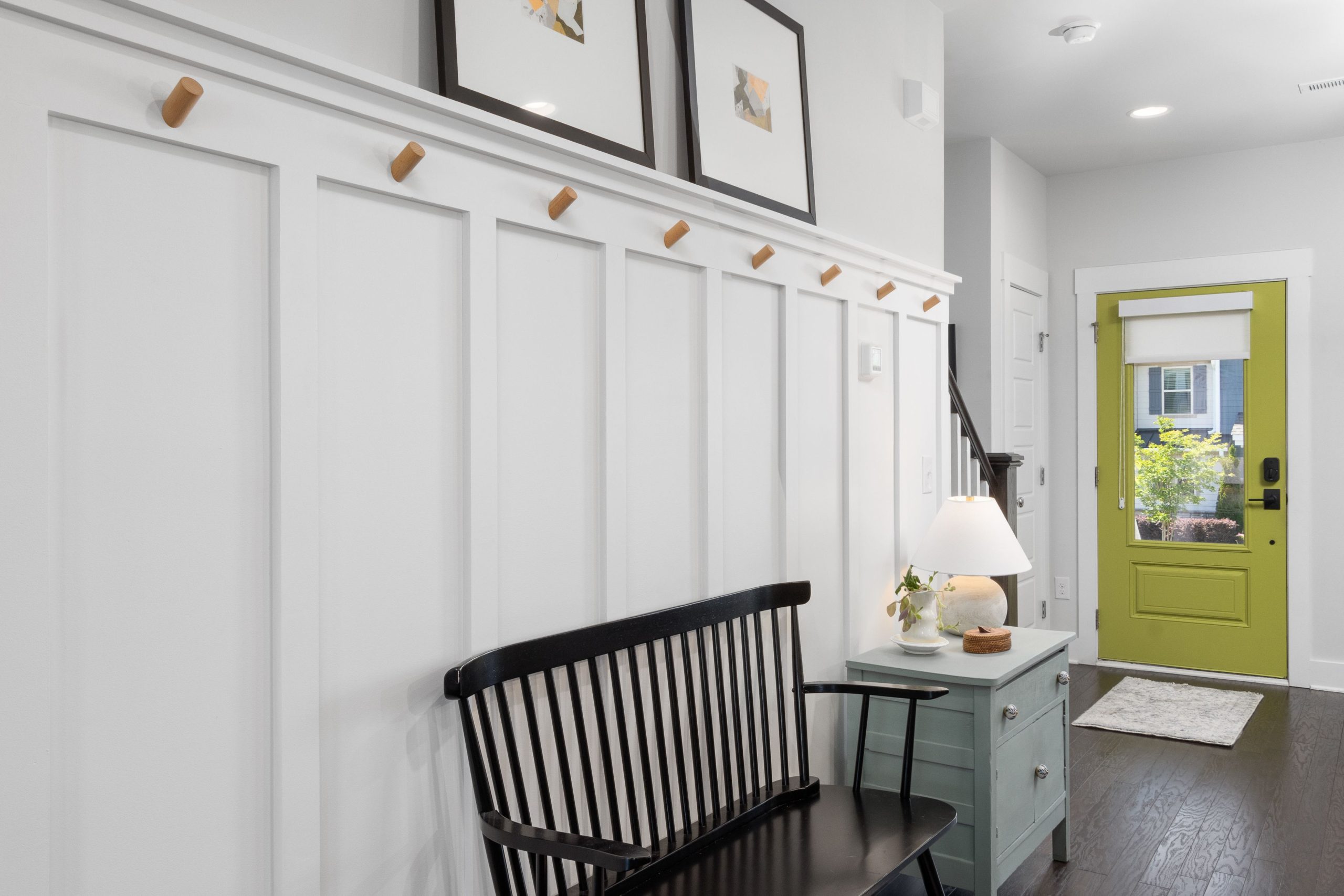
When painting an interior door a bold color, always get a sample pot and paint a large poster board first. Tape the board to your door and observe it for at least 48 hours. See how the color looks in the morning light, at midday, and with your evening artificial lighting. A color that looks perfectly cheerful in the bright light of day can turn garish or murky at night. This simple step can save you from a costly and time-consuming repaint job. Never trust a small paint chip to tell the whole story for a feature this prominent.
2. Warm Wood and Cool Gray in a Modern Farmhouse Entry
This look follows a simple but effective formula: 60% neutral base + 30% texture + 10% deep accent. The neutral base is the white board and batten, which keeps the space feeling bright and open. The texture comes from the warm, natural grain of the wood door and bench. The final 10% is that sliver of dark gray wall, which adds just enough visual weight and sophistication to keep the farmhouse vibe from feeling too rustic. You could swap the gray for a deep navy or a dark olive green to get a different but equally balanced mood while keeping the same formula.
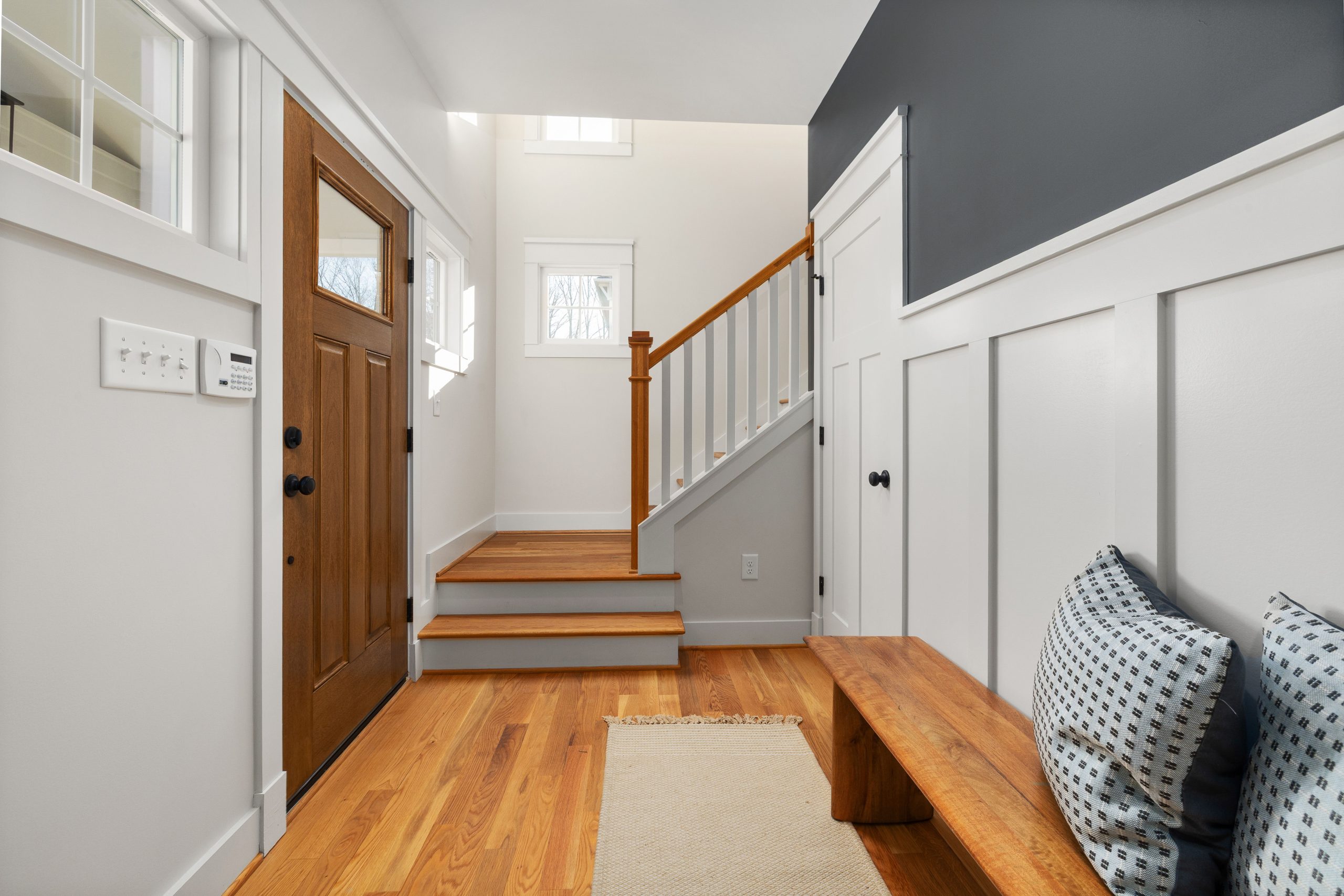
Let’s have some real talk about dark, matte accent walls in high-traffic entryways. While the deep gray color is stunning and adds incredible depth, be prepared for maintenance. Matte finishes are notorious for showing every single scuff, fingerprint, and bump from grocery bags or kids’ backpacks. If you have a busy household, consider using an eggshell or satin finish instead. It won’t be quite as velvety-matte, but it will be infinitely easier to wipe clean without leaving shiny spots, which is a major win for a space that sees this much action.
3. Curate an Artistic Entry with a Black Console and Sculptural Decor
that makes this entryway unforgettable is the large-scale textured art piece. Without it, you’d have a nice, but fairly standard, collection of objects on a console table. The art acts as the anchor and the focal point, providing a quiet, neutral backdrop that allows the more eclectic items—the sculptural busts, the brass lamps, the disco balls—to shine without creating visual chaos. Its size gives the entire vignette a sense of purpose and scale, proving that sometimes the most important element is the one that speaks the softest.
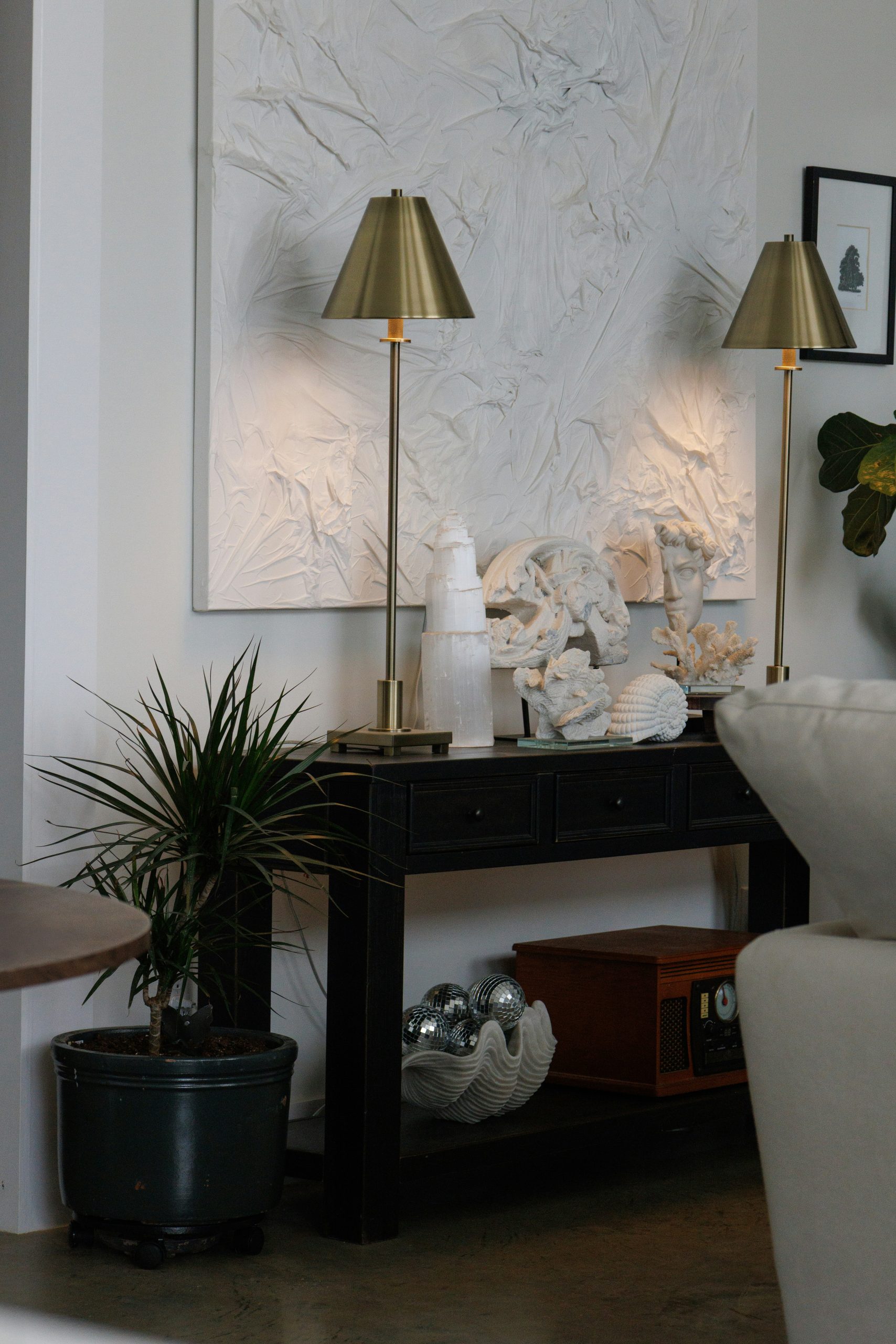
You don’t need a gallery budget to get this curated, artistic vibe. That chic black console? Look for a simple desk or sofa table on Facebook Marketplace and give it a coat of matte black paint ($50). For the large-scale textured art, DIY it! Get a large canvas from a craft store, a tub of drywall joint compound, and a putty knife. You can create incredible, high-end-looking art for under $75. Hunt for sculptural objects at thrift stores and flea markets—busts, interesting vases, and old corals can all be spray-painted a uniform white for a cohesive look.
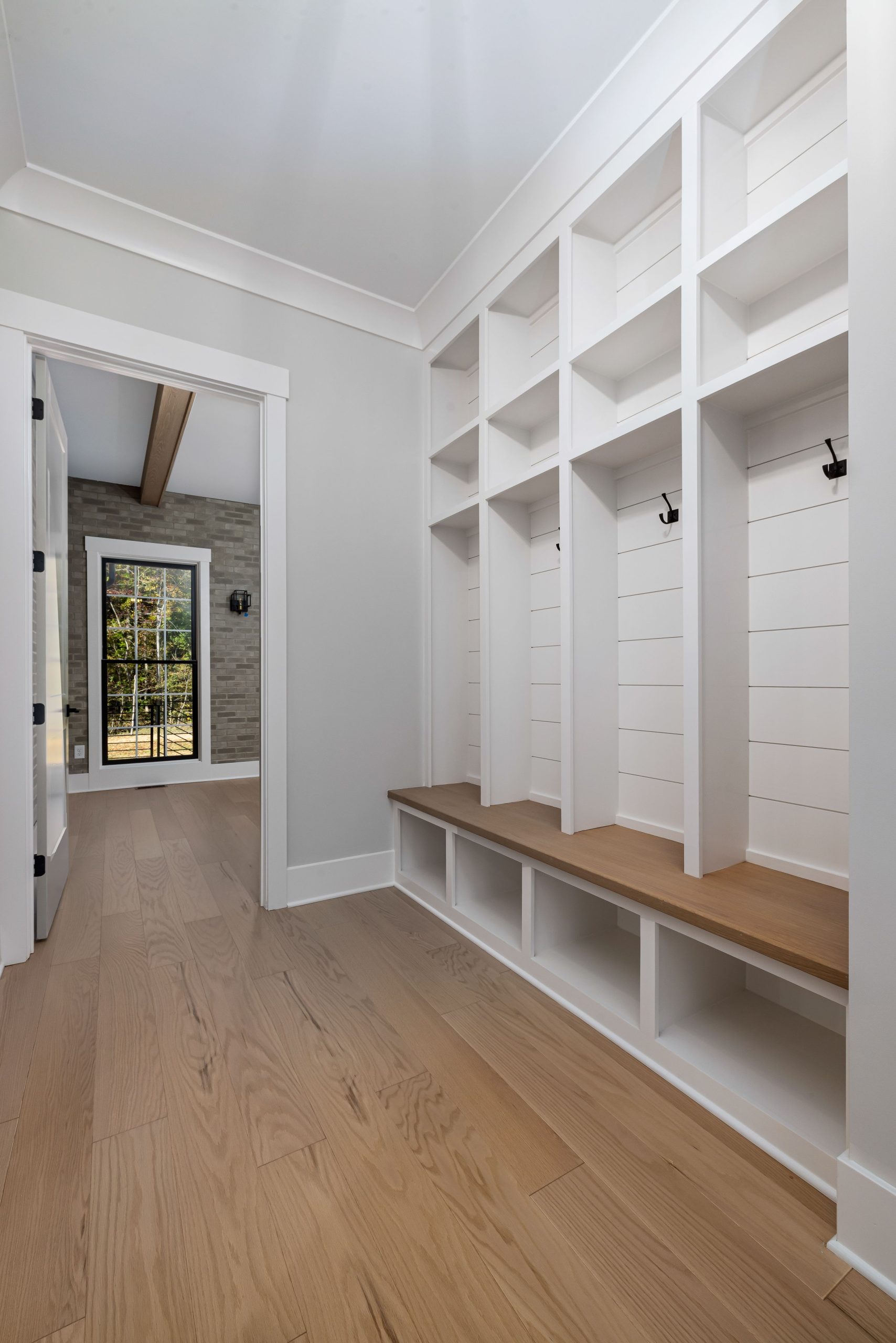
4. Streamlined Storage with White Shiplap Cubbies
Here’s a look at what it might cost to get this super functional, built-in look. Keep in mind that custom carpentry can vary widely by region.
- Custom Built-in Unit (MDF/Poplar): $2,500 – $5,500
- Shiplap Material & Installation: $500 – $1,200
- Light Wood Bench Top (Oak/Maple): $300 – $700
- Paint & Primer: $150 – $300
- Hardware (Hooks): $100 – $250
- TOTAL: $3,550 – $8,000
- Budget alternative: An IKEA hack using BILLY or BESTA units can achieve a similar look for around $1,500 – $2,500.
This long, linear built-in design is a dream solution for a specific type of space: the narrow hallway or entryway that’s at least 10-12 feet long but not much wider than 5-6 feet. The shallow depth of the bench and cubbies (typically 15-18 inches) keeps the walkway clear, while the vertical storage draws the eye upward, making the most of the wall space without encroaching on the floor plan. It wouldn’t work as well in a wide, open-concept entry where it might feel too small and disconnected from the larger room. Compare this to the more compact solution in Idea #11.
5. Make a Statement Underfoot with Patterned Floor Tiles
This entryway works because it commits to a single, bold statement. The patterned floor tile is the undisputed star of the show. By keeping everything else—the walls, the door, the trim—a simple, clean white, the design allows the floor to be the focal point without any competition. The painted brick wall adds texture and interest without introducing a new color, which is a smart-and-subtle design choice. The black frame of the glass door echoes the dark elements in the tile pattern, tying the whole look together with a crisp, graphic punch.
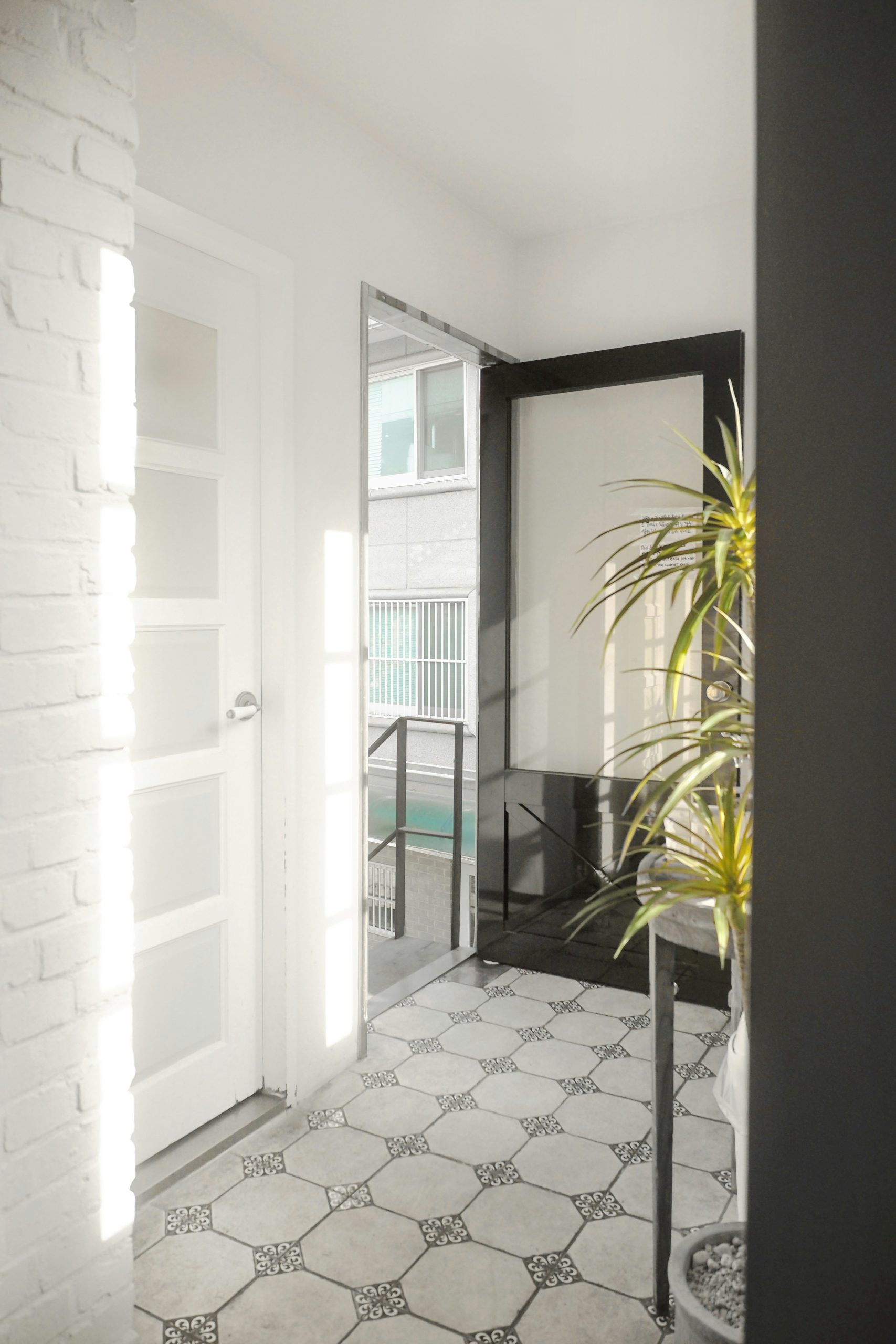
Those gorgeous patterned tiles are a showstopper, but they come with a reality check: grout lines. Especially with a light-colored tile and grout, you’ll be dealing with dirt and grime in a high-traffic entryway. To keep it looking fresh, you’ll need to scrub the grout lines every 2-3 months and reseal them annually to prevent staining. For a lower-maintenance option that gives a similar effect, consider luxury vinyl tile (LVT). Many LVT products offer incredibly realistic patterns with no grout lines to worry about, making cleanup as easy as a quick mop.
6. Classic & Clean: White Built-in Bench with Dark Wood Floors
The secret to making all-white built-ins feel custom and high-end is in the details of the trim work. Notice the substantial baseboard molding that wraps around the bench cubbies and the clean vertical lines of the paneling. This isn’t just a box—it’s integrated into the architecture of the room. When designing your own, ensure the trim style matches the existing trim in your home. And for cubbies, a standard opening of 15” x 15” x 15” is perfect for fitting most universal storage baskets, keeping the look tidy and intentional.
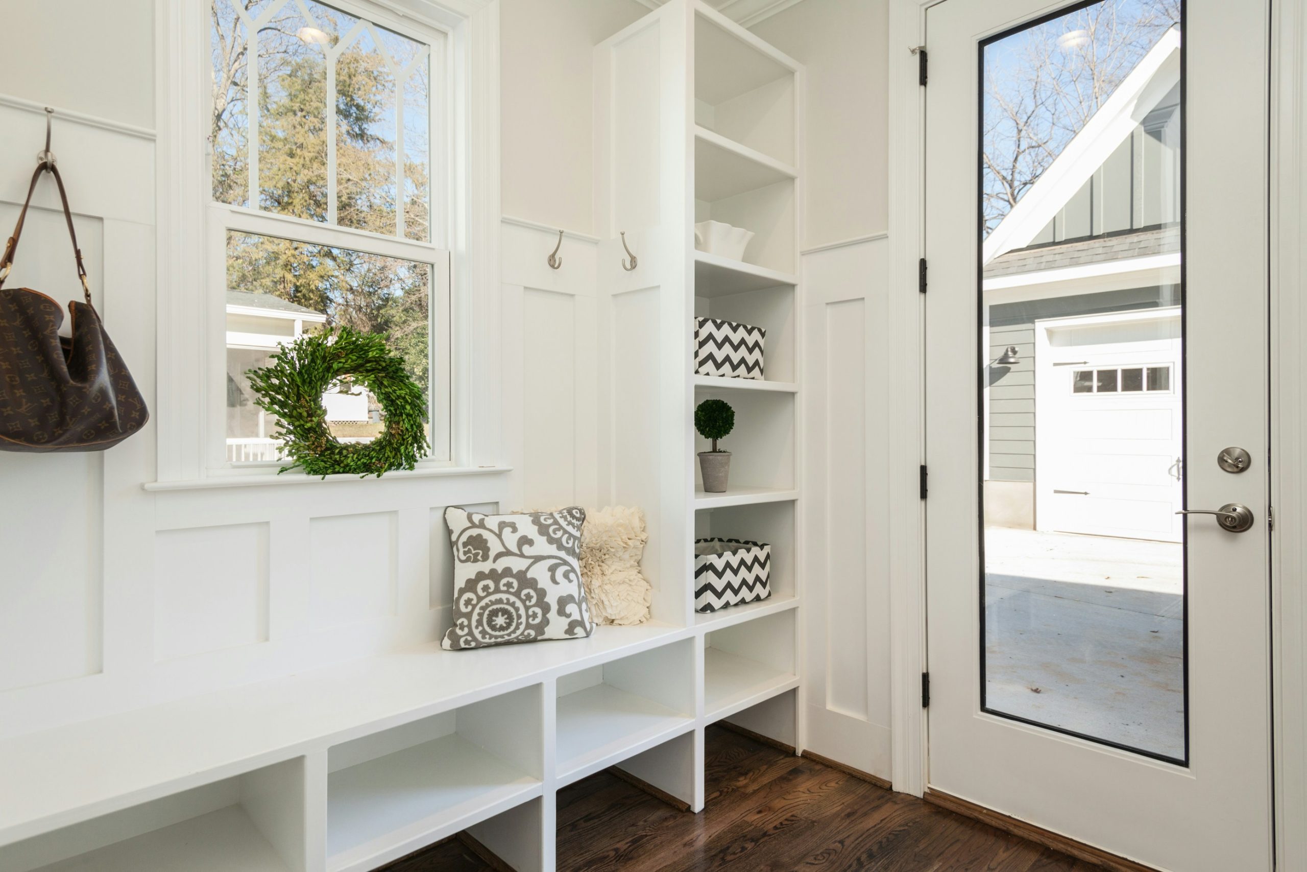
Want to add this kind of paneling to your own entryway? Here’s a quick guide to installing a simple vertical plank wall.
- Time Estimate: One weekend
- Material Cost: $200 – $500
- Step 1: Measure your wall and purchase 1×4 MDF or pine boards. Calculate how many you’ll need with your desired spacing (2-3 inches apart is standard).
- Step 2: Mark all wall studs with a pencil. Use a level to draw faint vertical lines where each board will go.
- Step 3: Cut your boards to height. Apply construction adhesive to the back of the first board and use a brad nailer to secure it to the wall, hitting the studs wherever possible.
- Step 4: Use a spacer block to position the next board and repeat until the wall is complete.
- Step 5: Fill nail holes with wood filler, caulk the seams, and paint everything to match your trim.
7. A Minimalist Mudroom with a Black Door and Wood Closet
The single element holding this entire design together is the bold, black-paneled door. It serves as a strong visual anchor in an otherwise light and neutral space. Without it, the light wood tones of the floor and closet might blend together, and the white walls would lack a focal point. The black provides a necessary point of contrast and sophistication, elevating the simple, functional elements from purely utilitarian to intentionally minimalist and modern. It proves you don’t need a lot of color to make a big impact if you use one strong accent decisively.
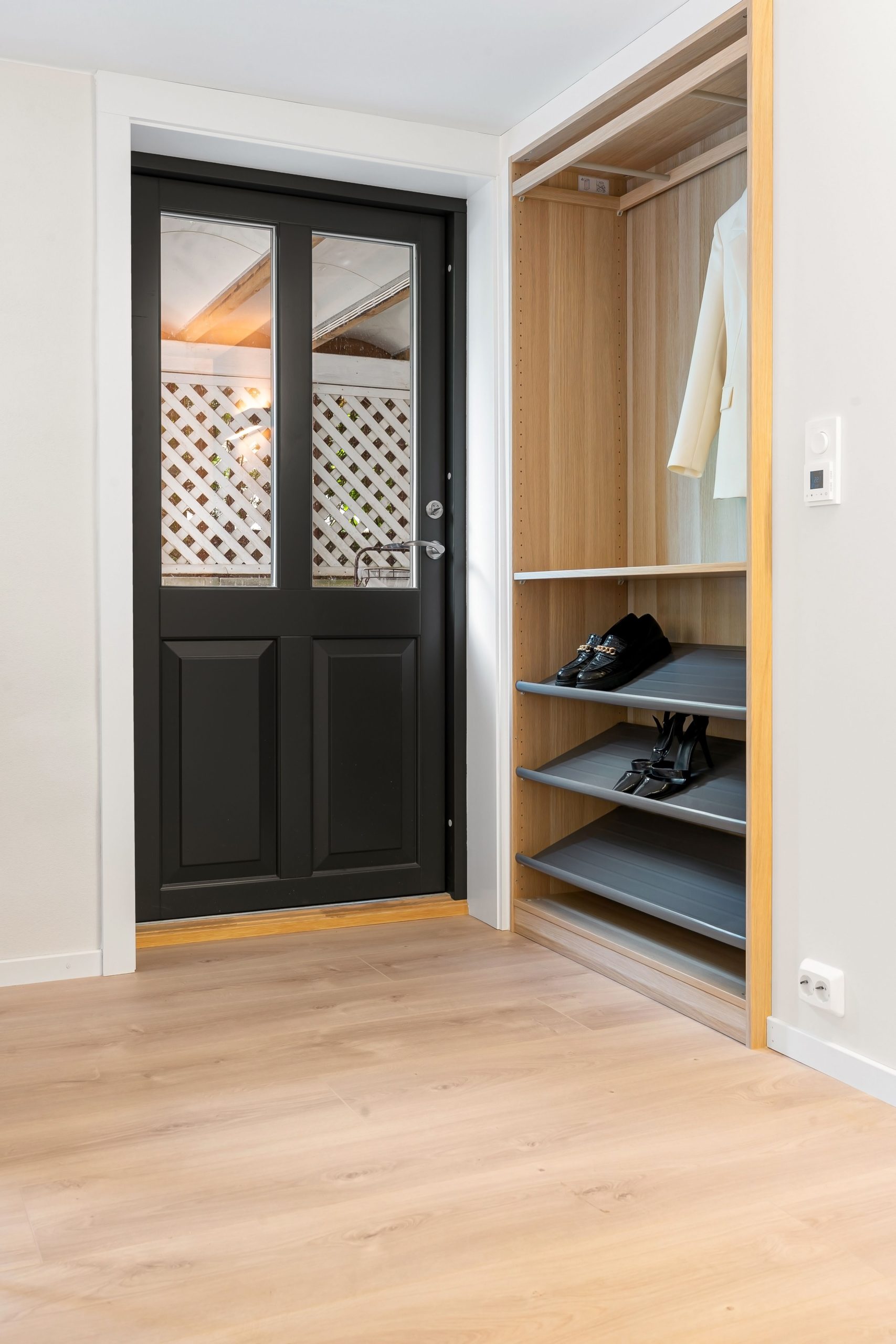
This “open closet” concept is brilliant for spaces that feel a bit tight or lack natural light. It works best in an entryway that is between 5 and 7 feet wide. A wider space might make the open storage feel sparse, while a narrower space would feel cluttered. By forgoing closet doors, you visually expand the area and keep it from feeling boxed in. The slanted shoe shelves are particularly smart, as they require less depth than flat shelves — a great trick for conserving precious inches in a compact mudroom. This is a much airier approach than the full built-in shown in Idea #4.
8. Simple and Sweet: A Minimalist Bench in a Bright Hallway
This little entryway nook is a perfect example of “less is more.” It works because it sticks to the absolute essentials and uses contrast to create interest. The space is defined by just three key items: a dark bench, a monochromatic cushion, and simple framed art. The dark wood of the bench provides a strong graphic line against the bright white walls and light wood floors. The simple “HOME” art reinforces the purpose of the space without adding visual clutter. It feels calm and welcoming precisely because it isn’t trying to do too much.
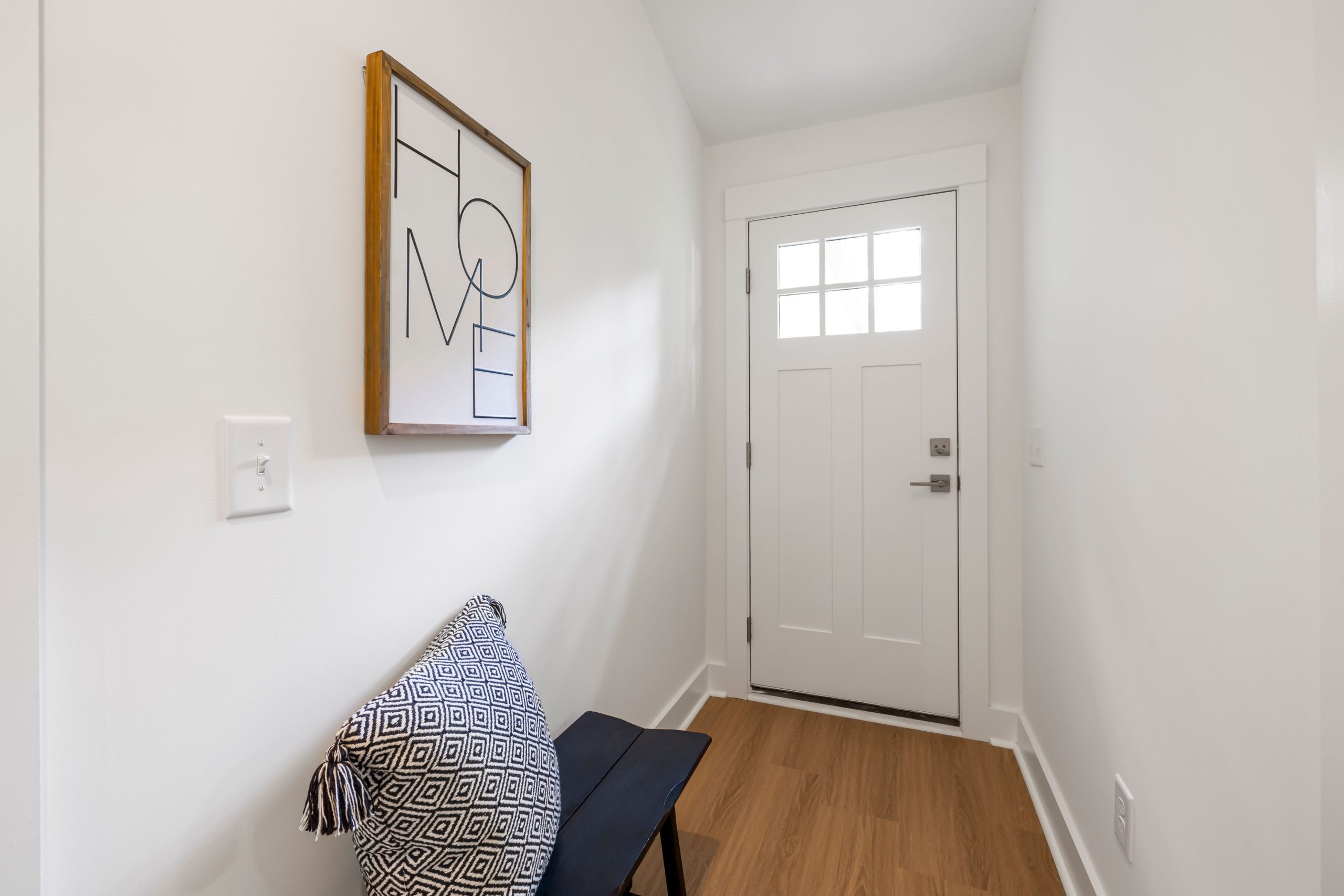
This is one of the most budget-friendly looks in the entire article. You can find a simple, clean-lined bench like this from stores like Target or Walmart for under $150. Even better, check Facebook Marketplace for secondhand finds that might just need a coat of dark paint. The framed art can be a simple DIY project—print the word “HOME” in a font you love and pop it in an affordable IKEA RIBBA frame. This entire vignette could easily be assembled for under $200, proving that a thoughtful entry doesn’t require a big budget.
9. Bright and Airy Entry with Light Wood and Shiplap
The formula for this breezy, modern space is all about balancing clean lines with natural textures. Think of it as 70% bright neutrals (white walls, grey floor tiles) + 20% natural wood (floors, bench, shelves) + 10% soft texture (blinds, textiles). The large sliding glass doors and light colors maximize the feeling of space and light. The wood elements prevent the white and grey from feeling cold or clinical, adding essential warmth. The key is keeping the wood tone consistent—a light, natural finish—to maintain that serene, Scandinavian-inspired vibe.
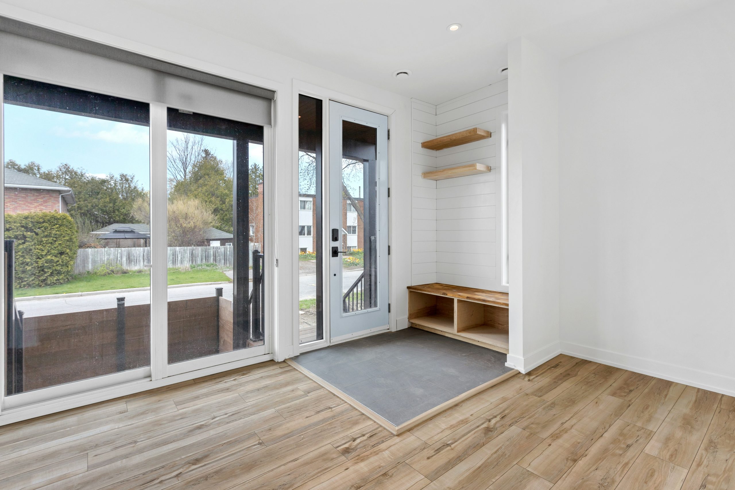
A mudroom nook right next to sliding glass patio doors is fantastic for light, but it comes with a functional challenge: dirt. This is a primary pathway for indoor-outdoor traffic, meaning mud, leaves, and water are guaranteed to be tracked in. The combination of grey tile at the immediate entry and wood-look plank flooring just beyond is a smart solution, as the tile is more durable and water-resistant. However, be prepared for constant sweeping and mopping right at this threshold to keep the entire space looking as clean and pristine as it does here.
10. A Functional Entry with a Vertical Slat Wood Wall
The clear star of this show is the vertical wood slat wall. It’s a brilliant way to add architectural interest, texture, and warmth to an otherwise simple space without overwhelming it. It transforms a plain wall into a deliberate design feature. More than just decorative, it also provides a sturdy and stylish foundation for the black hooks and blackboard organizer. By running the slats from floor to ceiling, it draws the eye upward, making the ceiling feel higher and the entire entryway feel more spacious and considered.
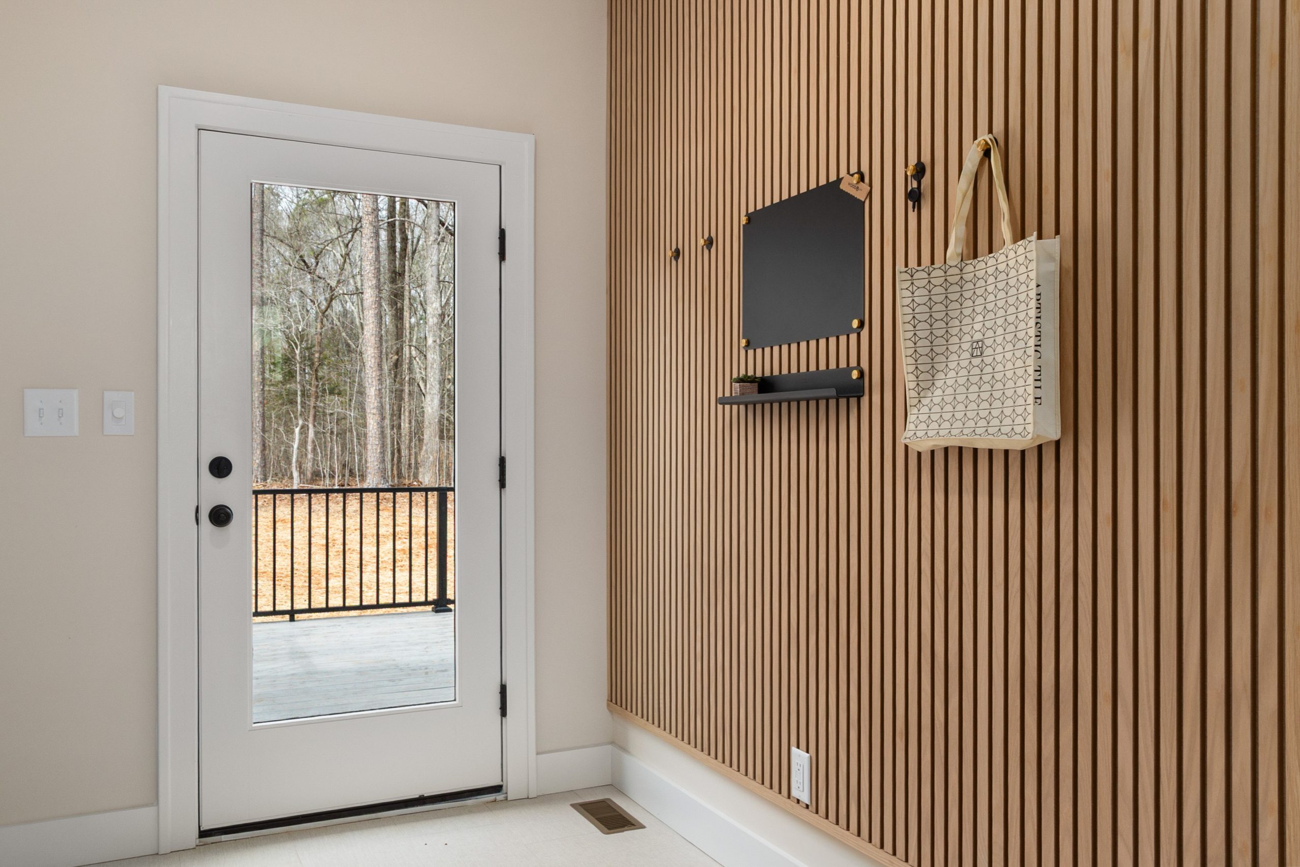
Want to create your own slat wall feature? It’s easier than it looks. Here’s a quick guide:
- Time Estimate: 4-6 hours
- Material Cost: $150 – $400
- Step 1: Choose your wood. Buy pre-made 1×2 oak or maple slats. For a budget version, use pine or rip down sheets of plywood.
- Step 2: Paint the wall behind the slats a dark color (like black or charcoal) to create depth. This is a pro trick that makes the gaps recede visually.
- Step 3: Determine your spacing. Use a scrap piece of wood (e.g., a 3/4″ thick piece) as a consistent spacer.
- Step 4: Start from one end. Use a level to ensure the first slat is perfectly plumb. Attach slats using a brad nailer and construction adhesive.
- Step 5: Continue across the wall, using your spacer for each new slat.
11. A Pop of Teal on Brick in a Compact Built-in Entry
This tiny space packs a huge design punch because it’s not afraid of color. The bold choice of teal paint on the brick wall creates instant personality and depth. The design works by pairing this strong color with crisp, bright white built-in furniture. The white prevents the teal from overwhelming the small space and keeps the overall feeling bright and functional. The dark wood door and brown cushion add a touch of warmth and earthiness that grounds the otherwise cool color palette of teal and white. It’s a lesson in balancing bold color with smart neutrals.
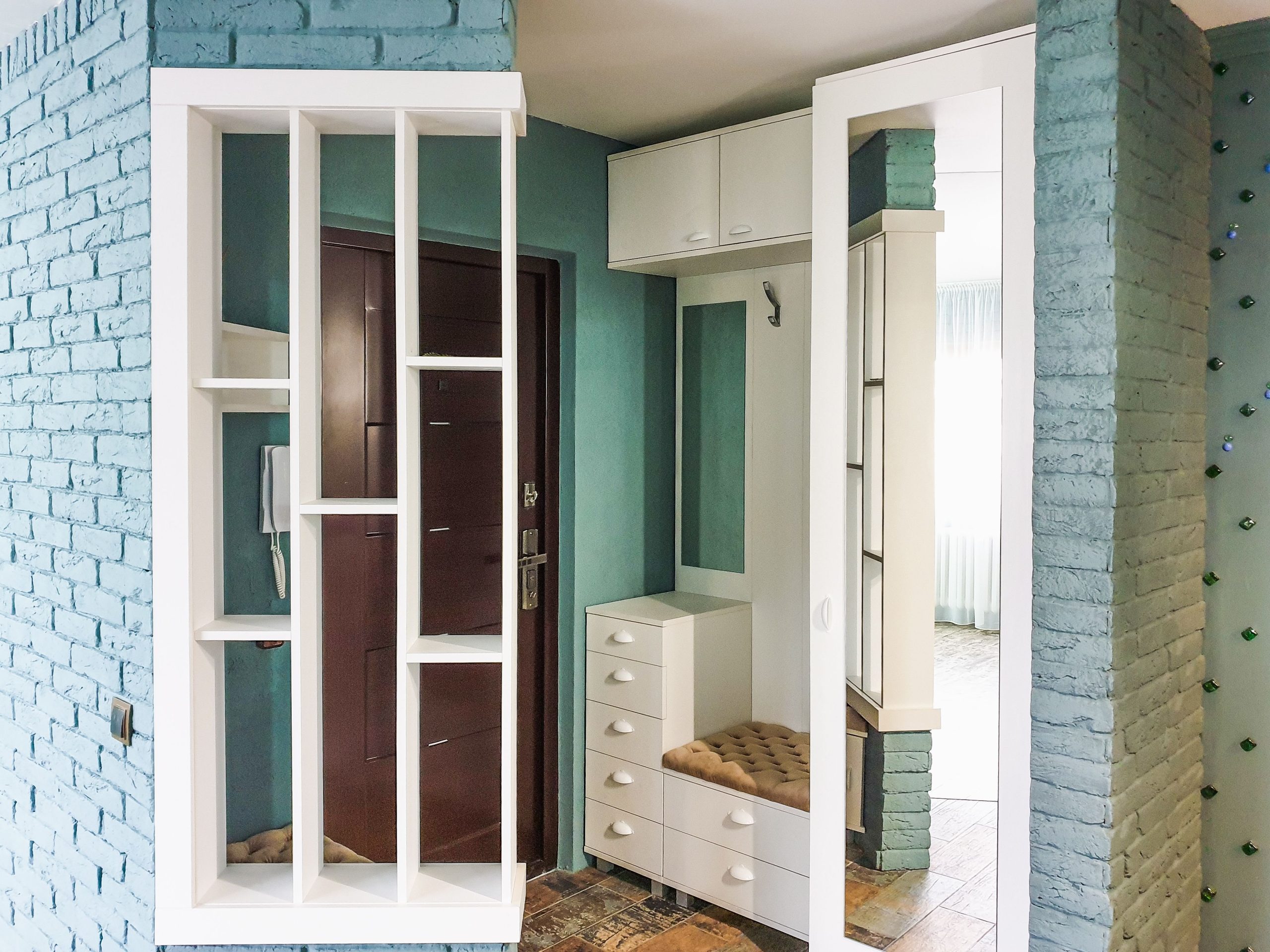
Painting brick, especially in an entryway, requires specific prep work. Don’t just roll on standard interior latex paint. First, you must clean the brick thoroughly with a wire brush and a TSP (trisodium phosphate) solution to remove any dust or efflorescence. Once it’s completely dry, apply a coat of masonry-specific primer (also called a block filler primer). This primer is designed to fill the porous surface of the brick and prevent the paint from soaking in unevenly. Only after priming should you apply your top coats of acrylic latex paint for a durable, long-lasting finish.
12. A Modern Neutral Entry with a Whitewashed Brick Wall
Thinking about creating a similar organized, neutral entry? Run through this checklist first:
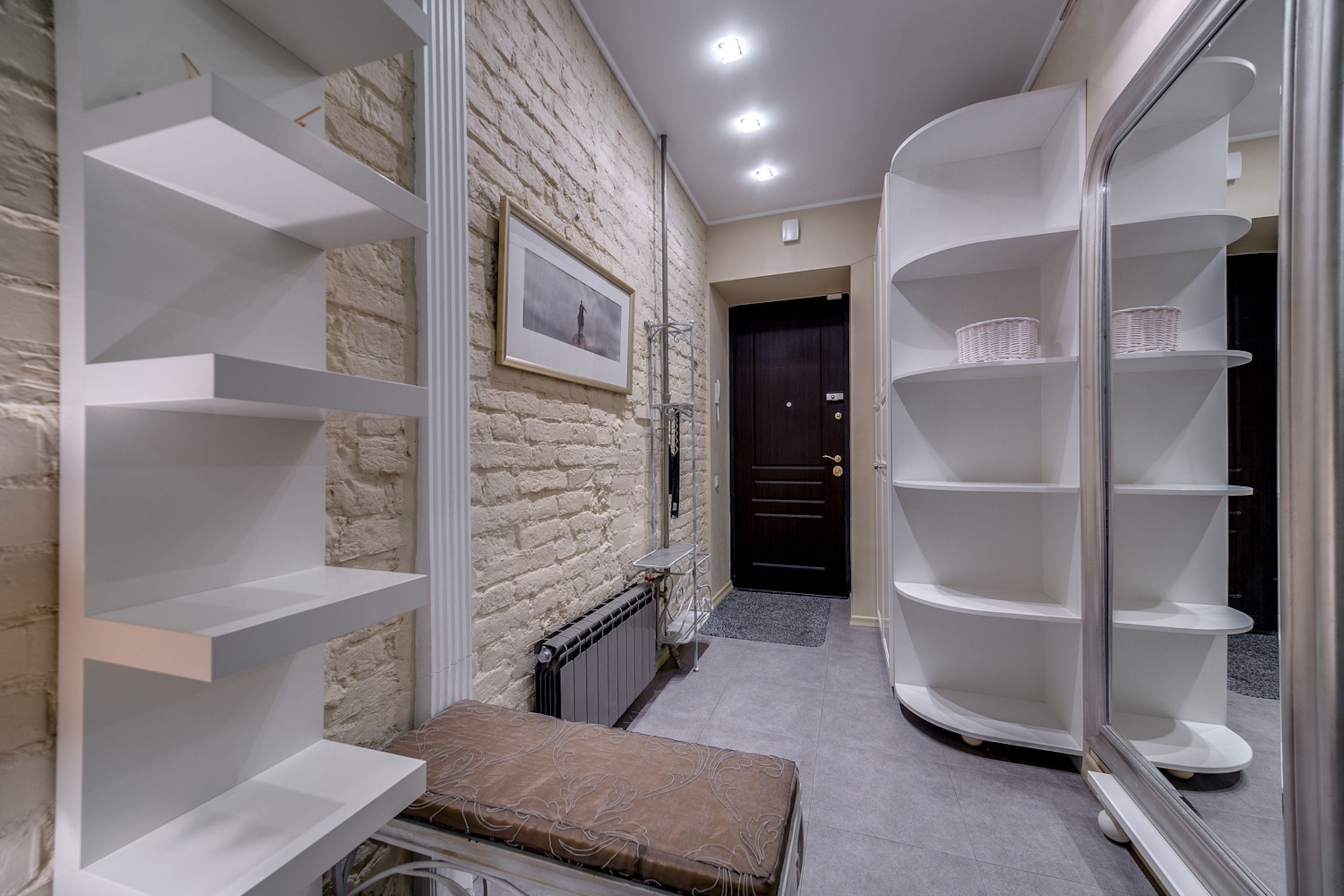
- Measure for function: Is your entry wide enough for a bench (at least 15″ deep) while still leaving a clear 36″ pathway? Don’t forget to account for the depth of any radiators or other fixtures.
- Check your light: A neutral palette like this relies on good lighting. Do you have recessed lights like these, or will you need to add a ceiling fixture or a lamp to keep it from feeling dull?
- Existing elements: Are you working with a feature like an exposed brick wall, or will you need to add texture in other ways (e.g., a jute rug, a wooden bench)? The texture is key to keeping neutrals interesting.
- Door swing: Notice the door opens away from the main storage area. Ensure your door swing doesn’t block access to your bench or shelves.
While a whitewashed or painted brick wall adds incredible texture, it also acts as a magnet for dust and cobwebs in its nooks and crannies. To keep it looking fresh, plan on a thorough vacuuming with a brush attachment every month or so. Be careful with scuffs; while durable, the painted surface can be chipped or scraped by bags, shoes, and keys. Keep a small amount of leftover paint and a little brush on hand for quick touch-ups to keep your textured wall looking intentional rather than neglected.
13. A Bold Entry with a Bright Red Door and Teal Walls
that absolutely makes this space sing is the fearless color combination. A bright fire-engine red door paired with a muted, dusty teal wall is not for the faint of heart, but the payoff is huge. It’s a perfect example of using complementary colors (red and green/teal) in a sophisticated way. The red is the loud, energetic star, while the muted teal provides a calming, colorful backdrop. The vertical white paneling acts as a neutral “breather” between the two strong hues, making the composition feel balanced rather than chaotic.
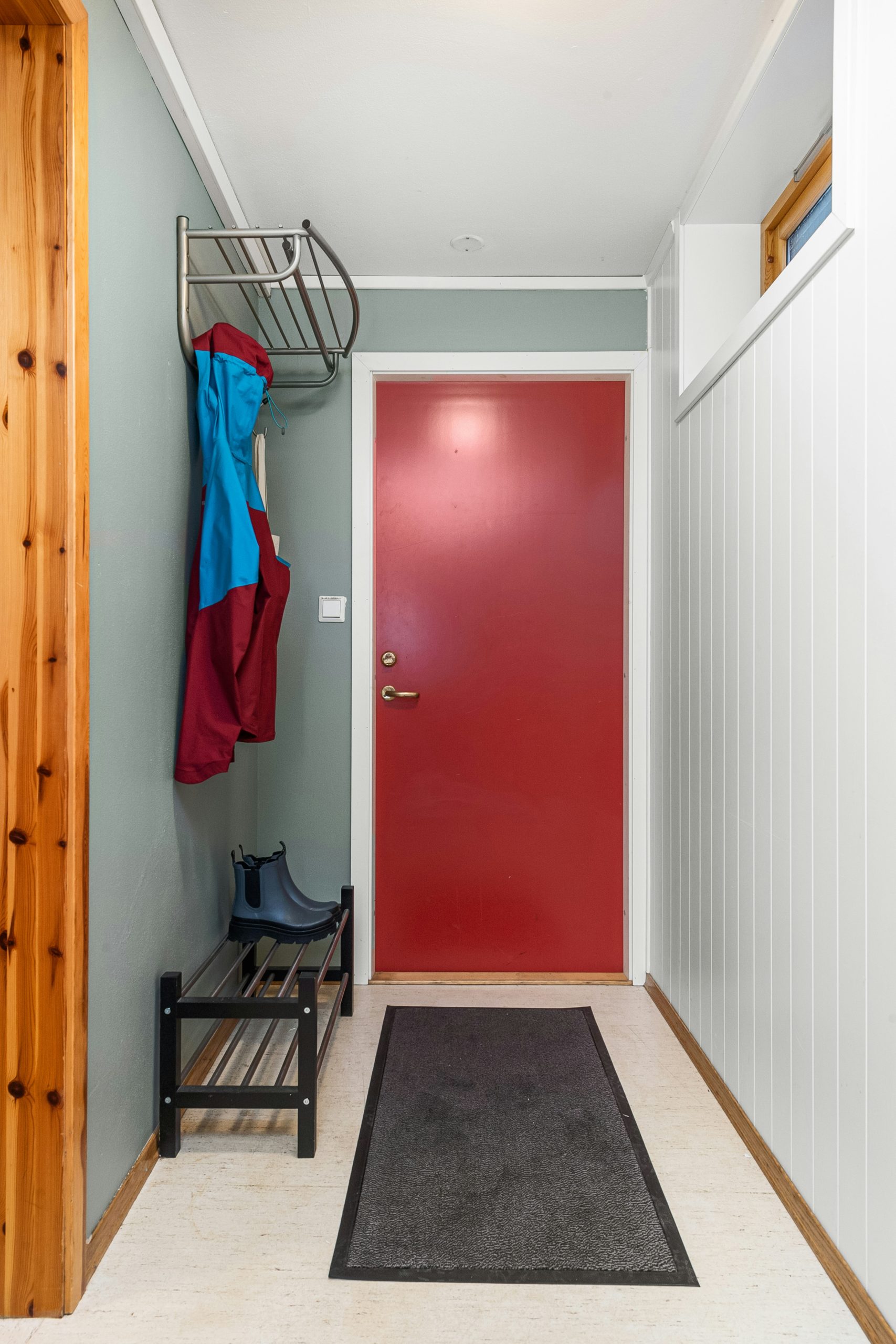
This is a vibrant and personality-filled entryway, but be honest with yourself about your tolerance for bold color over the long term. A bright red door is a major commitment. While it looks fantastic here, you need to be sure you love it enough to live with it every single day. Also, consider the resale implications. A highly specific color palette might not appeal to all potential buyers down the line. If you’re hesitant, try painting just the door first and living with it for a few months before committing to the colorful accent wall.
14. A Moody Entryway with Deep Green Walls and a Spindle Bench
The success of this moody, earthy entryway lies in its masterful use of contrast and natural texture. The deep, dark olive green on the walls creates a cozy, enveloping feeling. This could feel claustrophobic, but it’s beautifully offset by the crisp, bright white trim around the doorways, which acts like a picture frame, adding definition and light. The light wood of the spindle bench and the natural fibers of the jute rug pop against the dark walls and floor, providing necessary texture and preventing the space from feeling flat. This is a much cozier alternative to the brighter Idea #2.
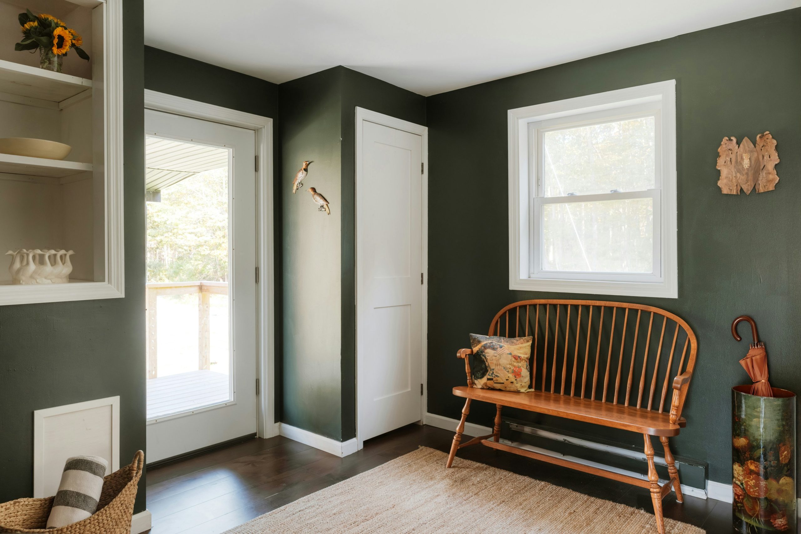
This look is right on trend for 2026, tapping into the broader design movement towards “biophilic design”—creating connections to nature within the home. The deep green walls, natural wood tones, and even the carved bird decor all speak to a desire for grounding, earthy spaces that feel like a retreat from the digital world. This isn’t just a color trend; it reflects a cultural shift towards interiors that feel calming, authentic, and connected to the natural world. It has staying power because it’s rooted in a fundamental human need for tranquility.
15. Warm Layered Textiles on a Rattan Entry Bench
This cozy corner follows a simple style recipe: 50% neutral foundation + 50% layered warm textures. The neutral foundation is the white paneled wall and the simple black hooks, which provide a clean, graphic base. The magic happens in the other 50%, which is all about layering. You have the woven texture of the rattan bench, the soft pile of the shearling jacket, the rustic weave of the patterned blanket, and the smooth leather of the boots. The colors—rust, brown, cream, and black—are all pulled from a warm, earthy palette, making the layers feel cohesive and inviting.
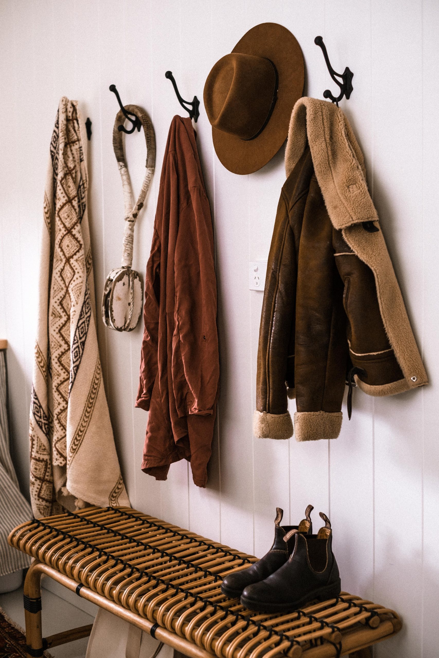
To get this effortlessly layered look, the trick is to vary not just the colors and patterns of your textiles, but also their weight and texture. Don’t just hang up three similar jackets. Instead, combine different materials. Think about pairing something nubby (like a wool blanket) with something smooth (like a leather bag), and something soft (like a shearling collar) with something structured (like a canvas tote). This variety is what creates visual interest and makes the arrangement look curated and intentional, not just like a pile of coats.
16. Cozy Rustic Mudroom with a Rattan Bench
that defines this space is texture. While the color palette is simple (mostly white and brown), the room feels rich and inviting because of the sheer variety of textures at play. You have the clean, linear texture of the vertical plank walls, the organic, woven texture of the rattan bench, the rugged texture of the shearling and leather jacket, and the soft, nubby texture of the patterned textile. Remove any one of these, and the room would feel significantly flatter. It’s a testament to the power of texture to create a mood. You can see a similar approach with different materials in Idea #14.
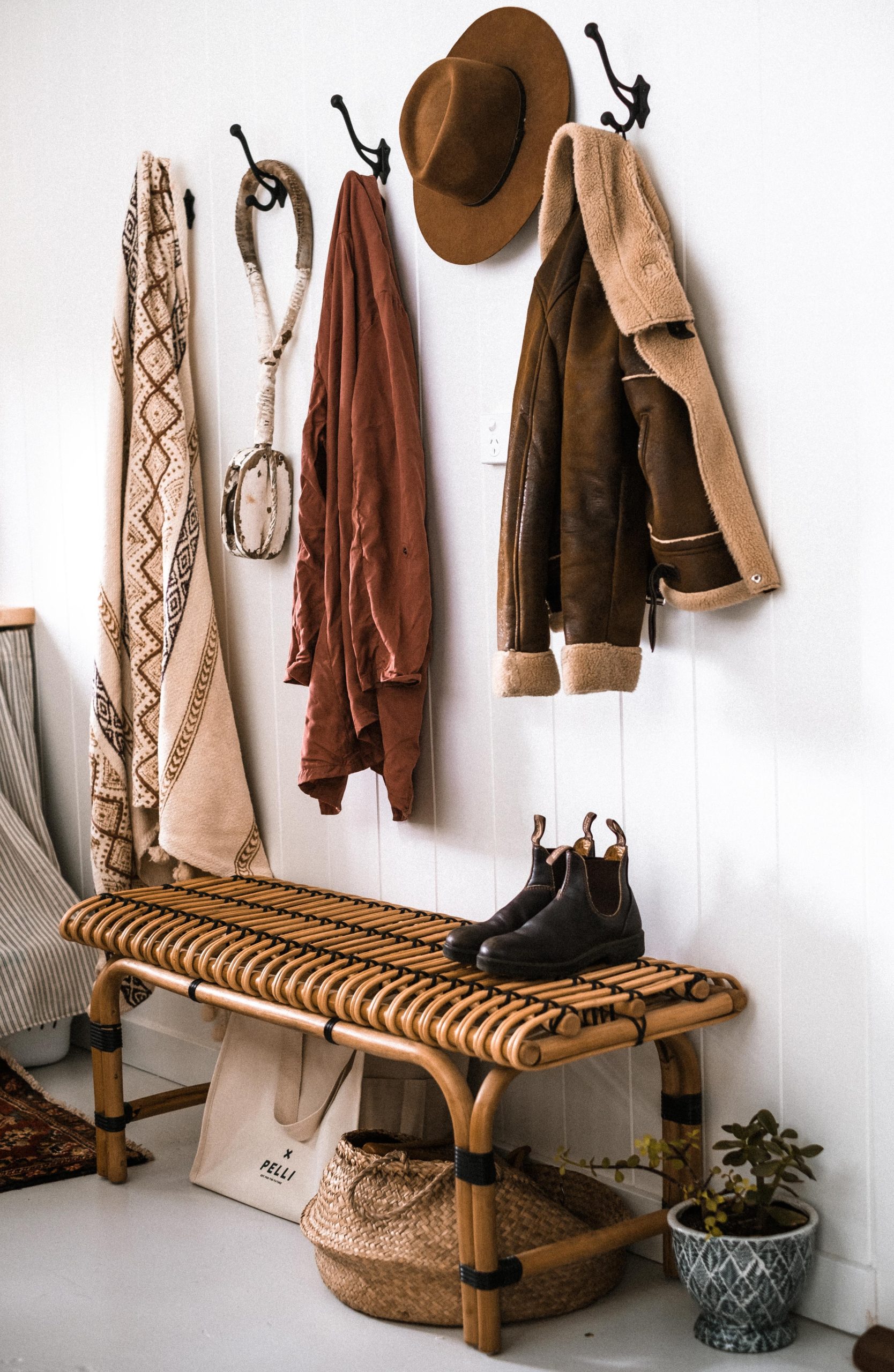
This entryway feels so welcoming because it masters the art of the “lived-in” look. It’s styled, but not sterile. The key is in the careful placement of functional items. The shearling jacket isn’t just thrown on a hook; it’s hung to show off its cozy collar. The boots aren’t kicked off in a corner; they sit neatly under the bench. The patterned throw is draped artfully. This approach suggests that even the most practical, everyday items can contribute to the beauty of a space when they are chosen with care and arranged with intention.
17. A Tidy Entry with a White Slat Wall and Woven Accents
The key to making a monochromatic white space feel warm and not sterile is to introduce a variety of natural textures. Here, the clean white backdrop of the slat wall and bench is the perfect canvas for the warm, organic textures of the woven straw bag, the smaller woven basket in the cubby, and the rich brown leather of the boots. To replicate this, follow the “3 Texture Rule”: in any minimalist space, incorporate at least three distinct natural materials (e.g., woven fiber, leather, wood, wool) to create depth and personality.
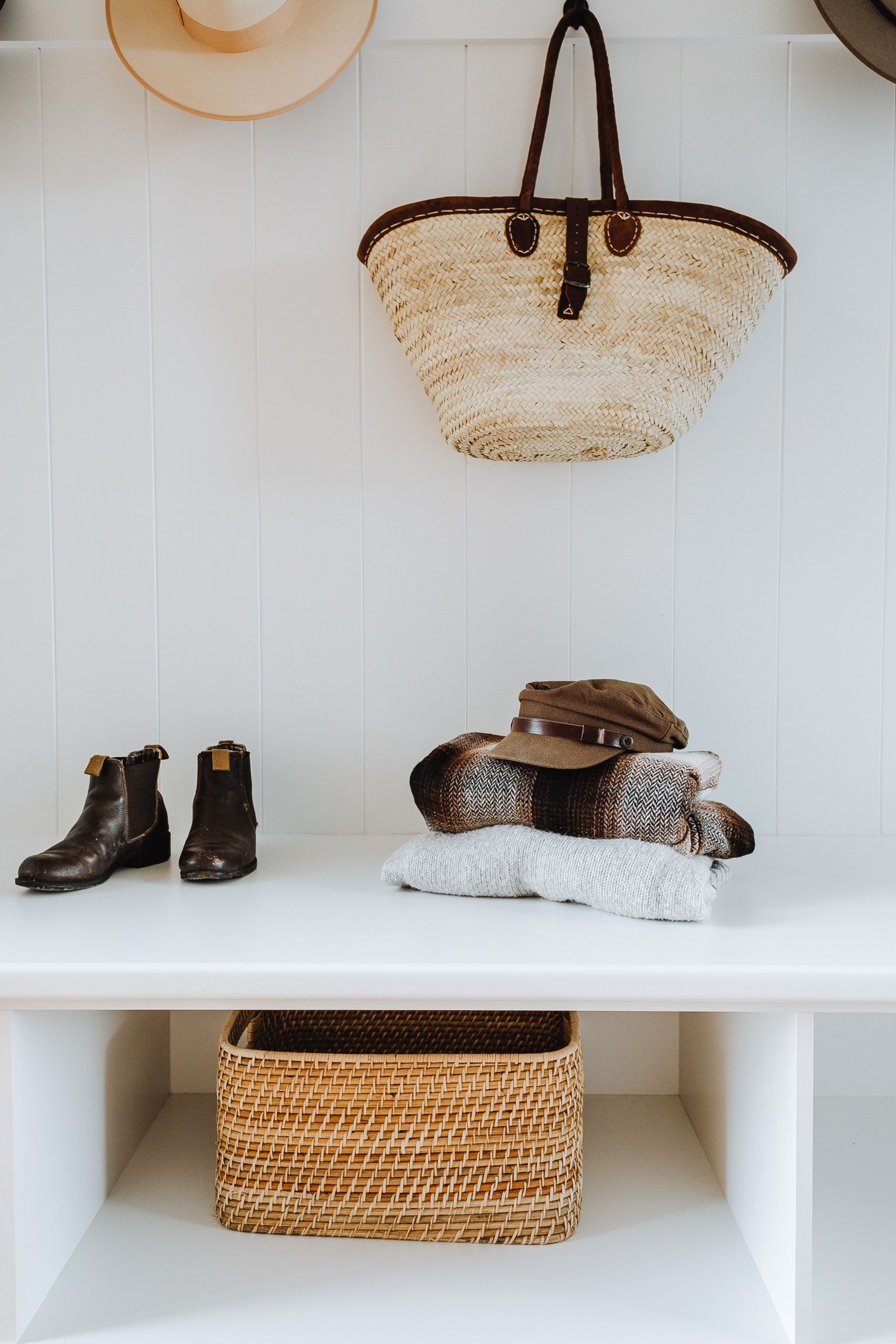
You can get this clean, natural look for much less. The core elements—a simple bench and a slat wall—are prime candidates for a DIY or IKEA hack. A simple white bench from IKEA, like the MÄCKAPÄR, costs around $70. You can create the slat wall effect behind it using affordable 1×2 pine boards from a hardware store, painted white. The real key is in the accessories: hit up Target for stylish woven baskets and check thrift stores or Poshmark for secondhand leather boots and bags to use as props. The entire look can be achieved for under $250.
18. A Minimalist IKEA-Style Shoe and Coat Rack
This setup is the epitome of functional minimalism, and it works because it focuses on clean lines and a simple material palette. The dark metal of the shoe rack and coat rail creates a strong graphic element against the soft light gray of the shiplap wall. The design is open and airy, which keeps the small space from feeling cluttered. The repetition of the woven straw texture in the hanging basket and the basket on the shelf adds a touch of organic warmth, preventing the look from becoming too industrial or cold. It’s simple, honest, and does its job perfectly.
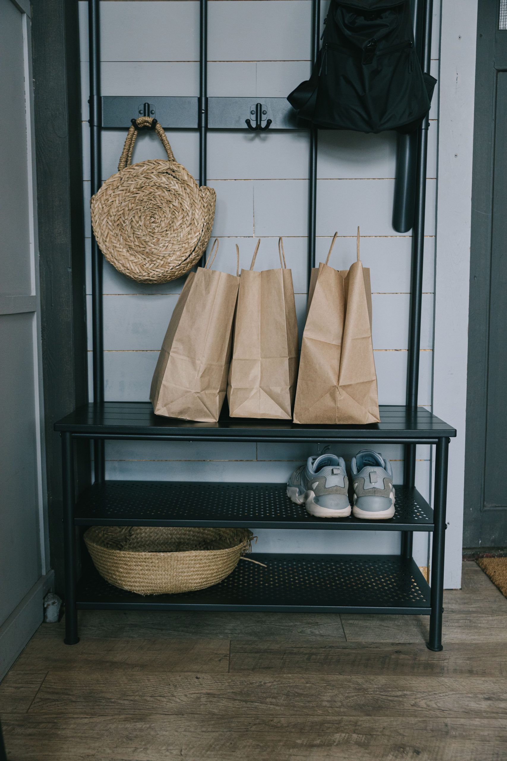
This is a fantastic example of a stylish entryway on a serious budget. Recreating this look is highly accessible.
- Shoe Rack (IKEA MACKAPÄR or similar): $25 – $50
- Wall-mounted Coat Rack (IKEA KUBBIS or similar): $20 – $40
- Woven Baskets (Target, Walmart): $15 – $30 each
- Shiplap Effect (Can be done with sharpie on painted wall for super budget version, or lightweight panels): $50 – $150
- TOTAL: $110 – $270
- Budget alternative: This entire look essentially *is* the budget alternative! It gives you 80% of the function of a custom built-in for about 5% of the cost.
19. A Charming Farmhouse Nook with a Wooden Hutch
The single most enchanting element in this entryway is the door with the ornate, orange-hued glass panel. In an otherwise quiet and traditional corner, this door is a piece of jewelry. It adds a completely unexpected touch of color and pattern, casting a warm, inviting glow into the space. It’s a vintage detail that gives the entire area a sense of history and personality that couldn’t be achieved with a standard, modern door. It reminds us that sometimes the most impactful design choices are the ones that are a little bit quirky and full of character.
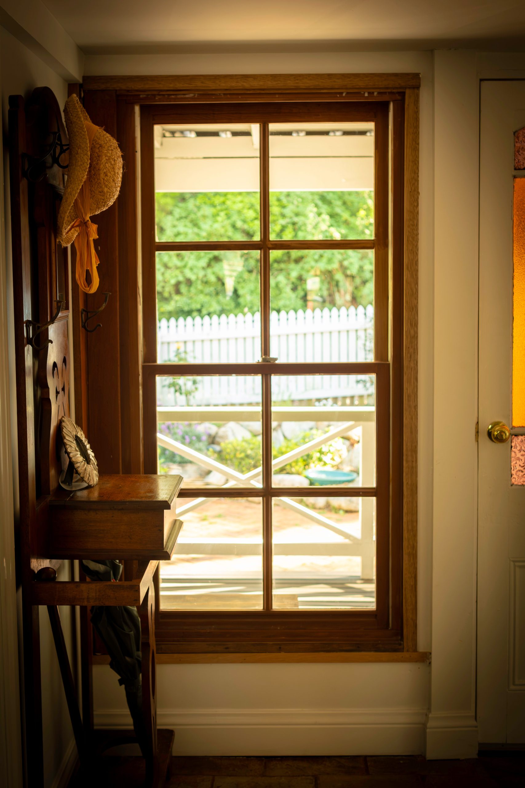
This cozy, hutch-focused setup is ideal for what’s often called a “secondary” entrance—perhaps a side door or an entrance from the garage, rather than a grand front entry. It works beautifully in a smaller, defined space, like a corner or a short wall that’s about 4-5 feet wide. The hutch provides just enough storage for the essentials of one or two people without overwhelming the room. It’s a perfect solution for adding function and charm to a space that might otherwise be an awkward, empty corner next to a door, where a larger bench system wouldn’t fit.
20. A Functional Mudroom with Open Storage and a Traditional Chair
This space successfully blends modern and traditional elements by using color to unify them. The dark gray of the modern panel doors is repeated in the dark brown/black tones of the floating shelf, the metal shoe racks, and the pattern on the traditional area rug. This repetition of color creates a cohesive visual thread that ties everything together. The warm wood of the traditional armchair picks up on the warm tones in the rug, while the light beige floor tiles provide a simple, neutral canvas that allows these different elements to coexist without clashing.
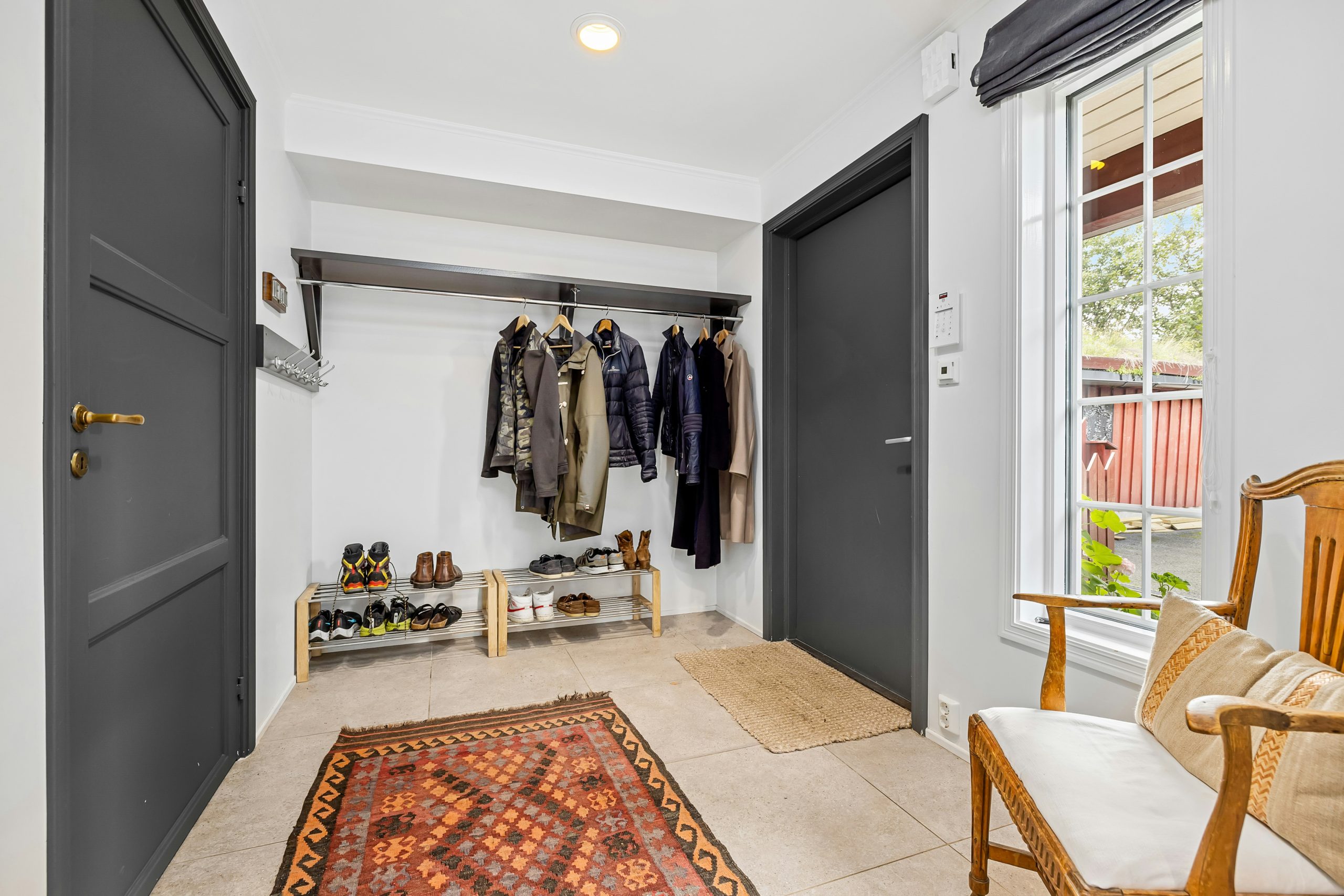
Planning a mudroom makeover with this “mix-and-match” storage approach? Here’s a quick checklist:
- Inventory your stuff: Before you buy a single shelf, empty your current closet. How many long coats do you have? How many pairs of shoes? Do you need space for boots? Let your actual storage needs dictate the components you choose.
- Measure vertically: An open shelf with a rod needs to be mounted high enough for coats to hang freely without pooling on the floor. A height of 65-70 inches from the floor to the rod is a good standard.
- Establish a color story: Decide on 2-3 unifying colors. Here it’s dark gray/black, wood tones, and white. Stick to this palette when choosing your separate storage pieces to ensure they look cohesive.
21. A Serene Entry with a Light Wood Bench and White Cabinetry
The standout feature here is the seamlessly integrated light wood bench. What makes it special are the soft, rounded corners where it meets the white cabinetry. This is a subtle but high-end custom detail that elevates the entire design. It turns a simple bench into a beautifully crafted, sculptural element. This softness is a welcome contrast to the otherwise clean, straight lines of the cabinetry, creating a look that feels modern and minimal, yet gentle and approachable. It’s a detail that says “thoughtful design” without shouting.
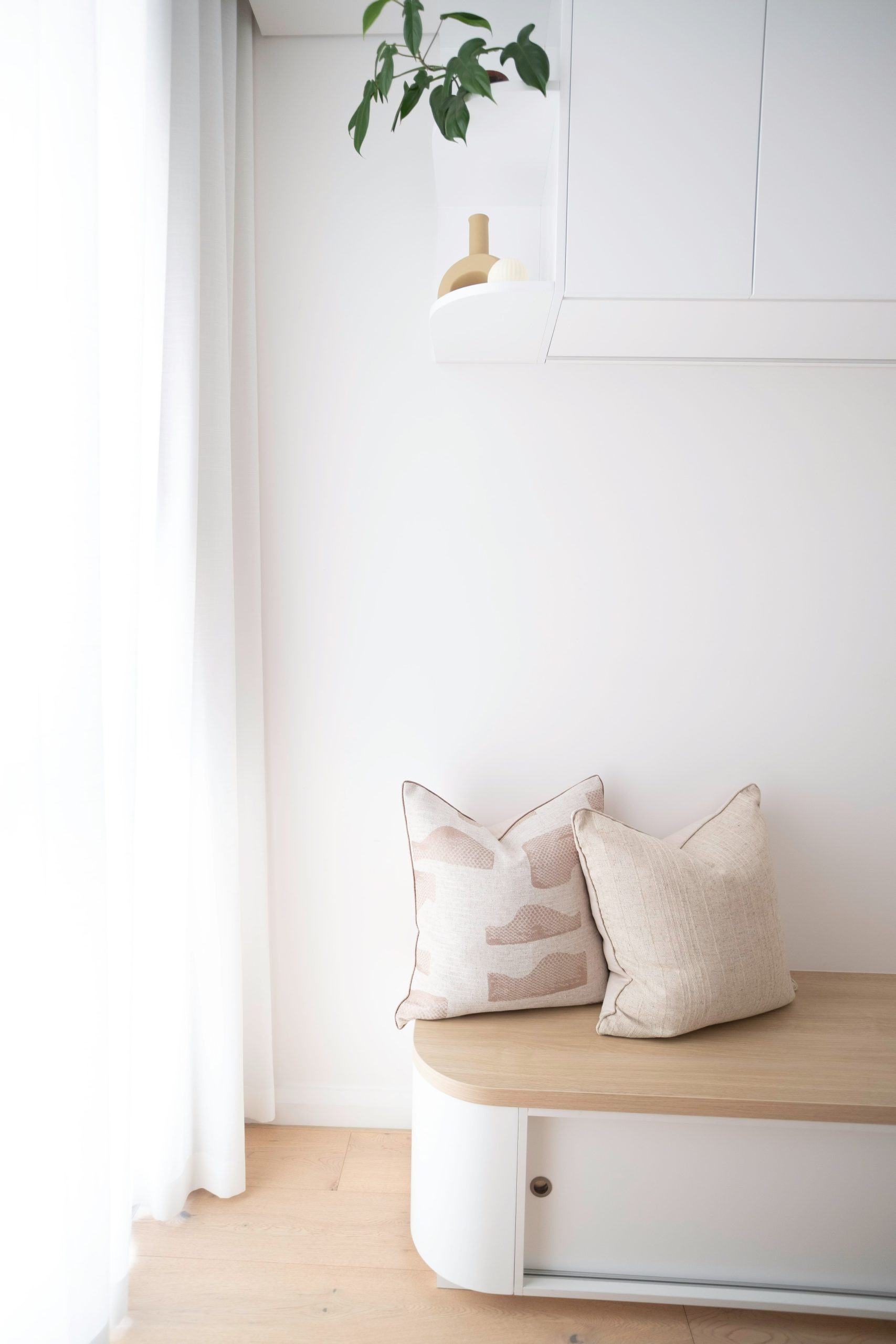
This serene look is a study in quiet, tonal balance. The formula is roughly 70% crisp white + 20% light, natural wood + 10% soft, warm accents. The white cabinetry and walls create a gallery-like, light-reflecting base. The light wood of the bench and flooring adds essential warmth and an organic touch. The final 10% comes from the subtle textures and colors of the throw pillows—the cream, beige, and faint terracotta—which add just enough personality and comfort to make the minimalist space feel like a home. You could swap the pillows for versions in sage green or dusty blue for a cooler but equally calm effect.
22. A Sleek, Minimalist Hallway with Integrated White Storage
This hyper-minimalist entryway works because of its unwavering commitment to a single, monolithic concept. The tall, white, flat-panel cabinets are designed to blend in with the white walls, creating an uninterrupted visual plane. The design prioritizes seamlessness over features. By hiding all the potential entryway clutter behind these doors, the hallway maintains a serene, gallery-like feel. The long, silver-toned handles add a touch of sleek, geometric detail, emphasizing the verticality and tying into the cool tones of the gray floor. This is a very different feeling from the open storage in Idea #7.
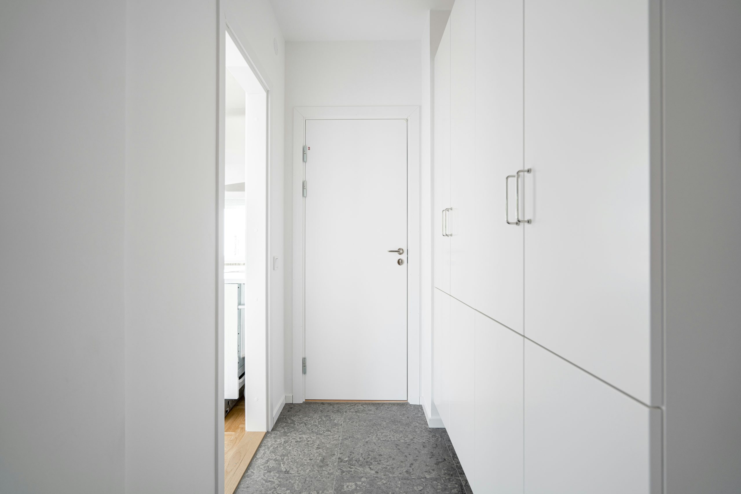
This look is stunning and incredibly tidy, but let’s be honest about the lifestyle it requires. An all-white, hyper-minimalist entryway demands constant vigilance. Every fingerprint on the cabinet doors will show. The lack of an open bench or a single hook means there is zero tolerance for “drop and go.” Every single item must be put away behind a cabinet door immediately. If you have kids, pets, or a habit of leaving your shoes by the door, this pristine look might become a source of stress rather than serenity. It’s beautiful, but it’s a commitment.
23. A Geometric Entry with a Hexagonal Tile Accent Wall
The element that elevates this entryway from simply nice to truly special is the hexagonal tile accent wall. It serves multiple functions: it adds pattern, texture, and a sophisticated color palette all in one go. The mix of muted blue-grays, beiges, and whites within the tiles creates a beautiful, mosaic-like effect that provides all the “art” the wall needs. It defines the bench area as a distinct zone within the entryway and provides a durable, wipeable surface—a perfect marriage of beauty and practicality that makes the whole space feel custom and intentional.
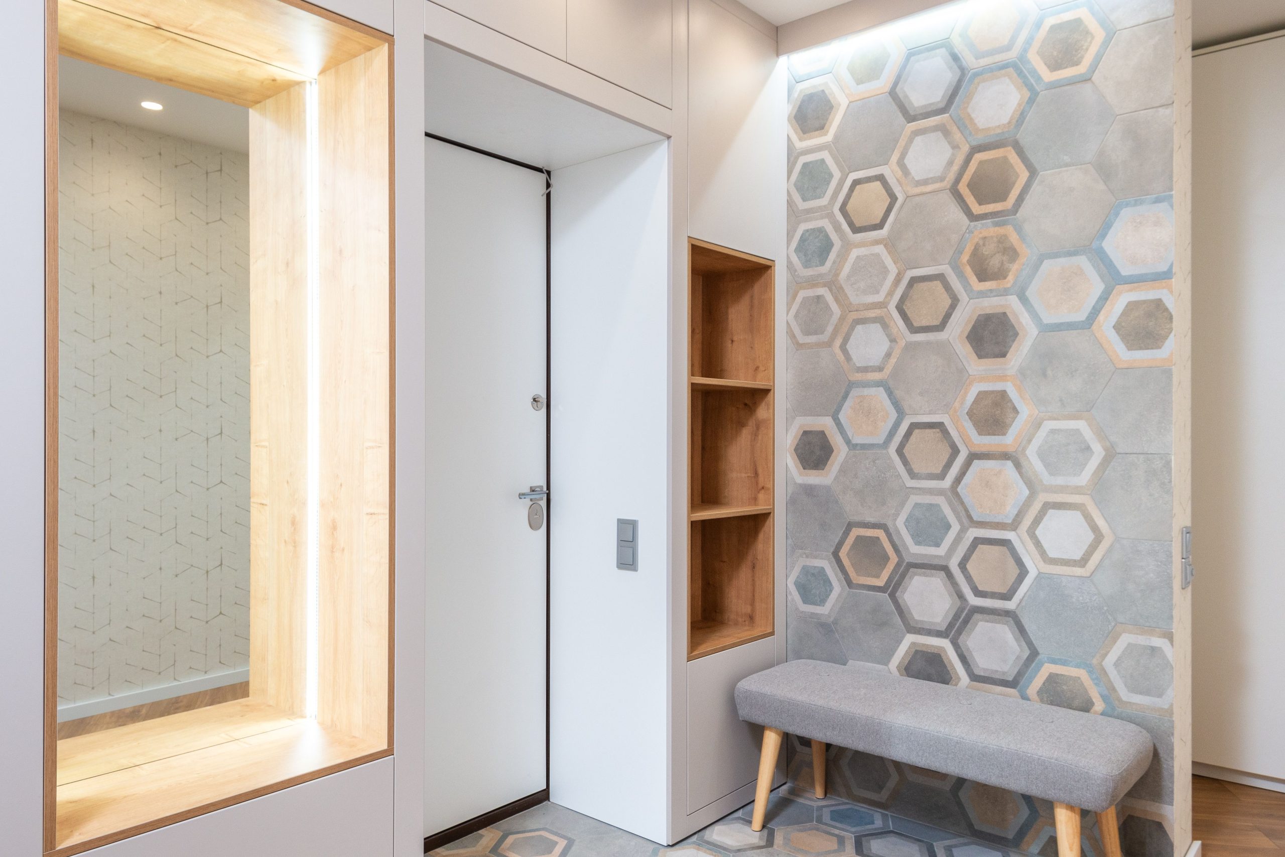
When you have a strong pattern on a wall, like these hexagonal tiles, keep the other large elements in the space simple and solid. Notice how the upholstered bench is a solid, neutral gray and the wood frame of the mirror is a simple, clean-lined rectangle. If the bench had a busy pattern or the mirror frame were ornate, they would compete with the tiles, creating visual chaos. Let your statement feature be the star and have everything else play a supporting role. The integrated light on the mirror is another smart choice, as it adds function without adding more visual clutter.
24. A Crisp White Mudroom with Natural Wood-Look Floors
This is a classic for a reason. The design formula is simple and effective: high contrast and clean lines. The brilliant white of the walls, door, and built-in storage creates a bright, airy feeling and reflects maximum light, making the space feel larger. This is balanced and warmed by the natural wood-look plank flooring. The stark black of the door handle and hinges acts as a crisp, graphic accent, adding a touch of modern farmhouse flair and preventing the all-white scheme from feeling one-dimensional. It’s a timeless look that feels both fresh and functional.
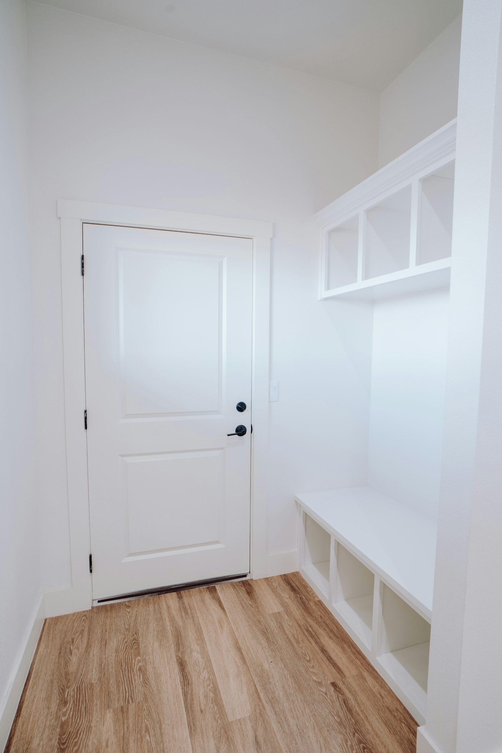
While custom built-ins are a significant investment, you can achieve this clean and functional look with pieces from IKEA. Start with a MACKAPÄR bench with shoe storage as your base. For the upper portion, you can install a simple Lack wall shelf and a row of classic black hooks underneath. To get that “built-in” feel, paint the IKEA pieces the exact same shade of white as your wall and trim. This simple paint trick helps the separate pieces read as a single, cohesive unit, giving you 90% of the look for a fraction of the cost—likely under $300.
25. A Modern Entry with a Dark Wood Built-in and Patterned Cushions
This entryway masters a sophisticated, moody neutral palette. The style equation is about 60% dark, textured wood + 30% light neutral surfaces + 10% pattern and shine. The large built-in unit provides the dominant, grounding element. The light gray walls and light wood-look floor tiles keep the space from feeling too heavy or dark. The final 10% is where the personality comes in: the graphic pattern on the bench cushions adds visual interest, and the chrome hardware on the door and unit provides a touch of metallic shine, completing the modern look.
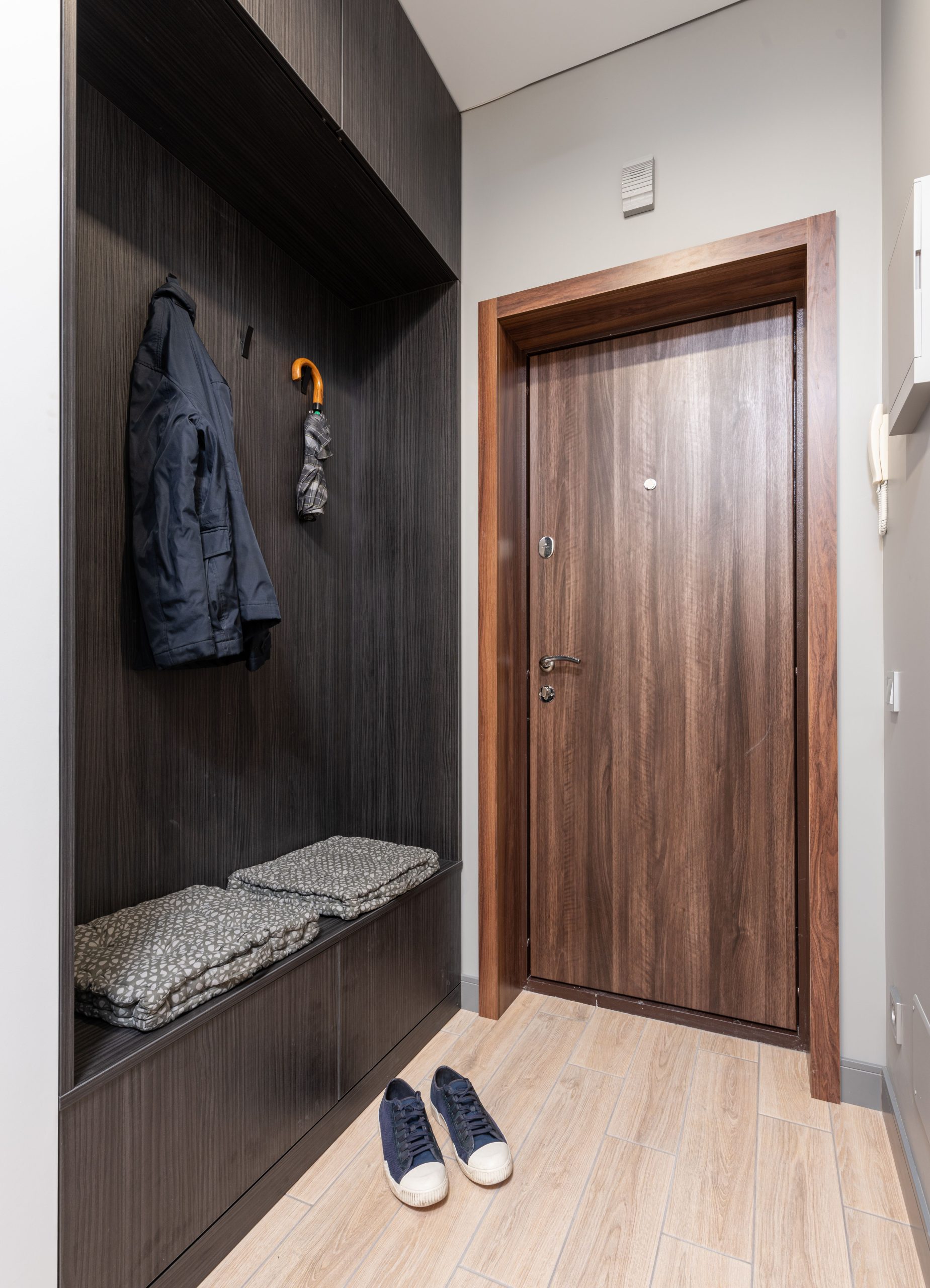
A built-in unit with a dark, textured wood finish is undeniably handsome and modern. However, be aware that dark surfaces, especially in a busy entryway, can be less forgiving than they appear. They tend to show dust more readily than lighter wood tones. The textured finish can also be a bit trickier to wipe down than a smooth surface. If you love the look but not the potential upkeep, consider a similar style in a mid-tone wood, which is far more forgiving when it comes to daily dust and grime.
26. A Bright Minimalist Entry with Wood and Mirrored Accents
that makes this entryway feel so expansive and bright is the wall of dark gray mirrored panels. While it might seem counterintuitive to use a dark color to brighten a space, the reflective surface is the key. The mirror bounces light from the rest of the home into the entryway and, more importantly, it creates the illusion of a much wider space. It visually doubles the width of the hallway, turning a potentially narrow corridor into an open and airy entry. The dark tint adds a layer of sophistication and moodiness that a clear mirror wouldn’t have.
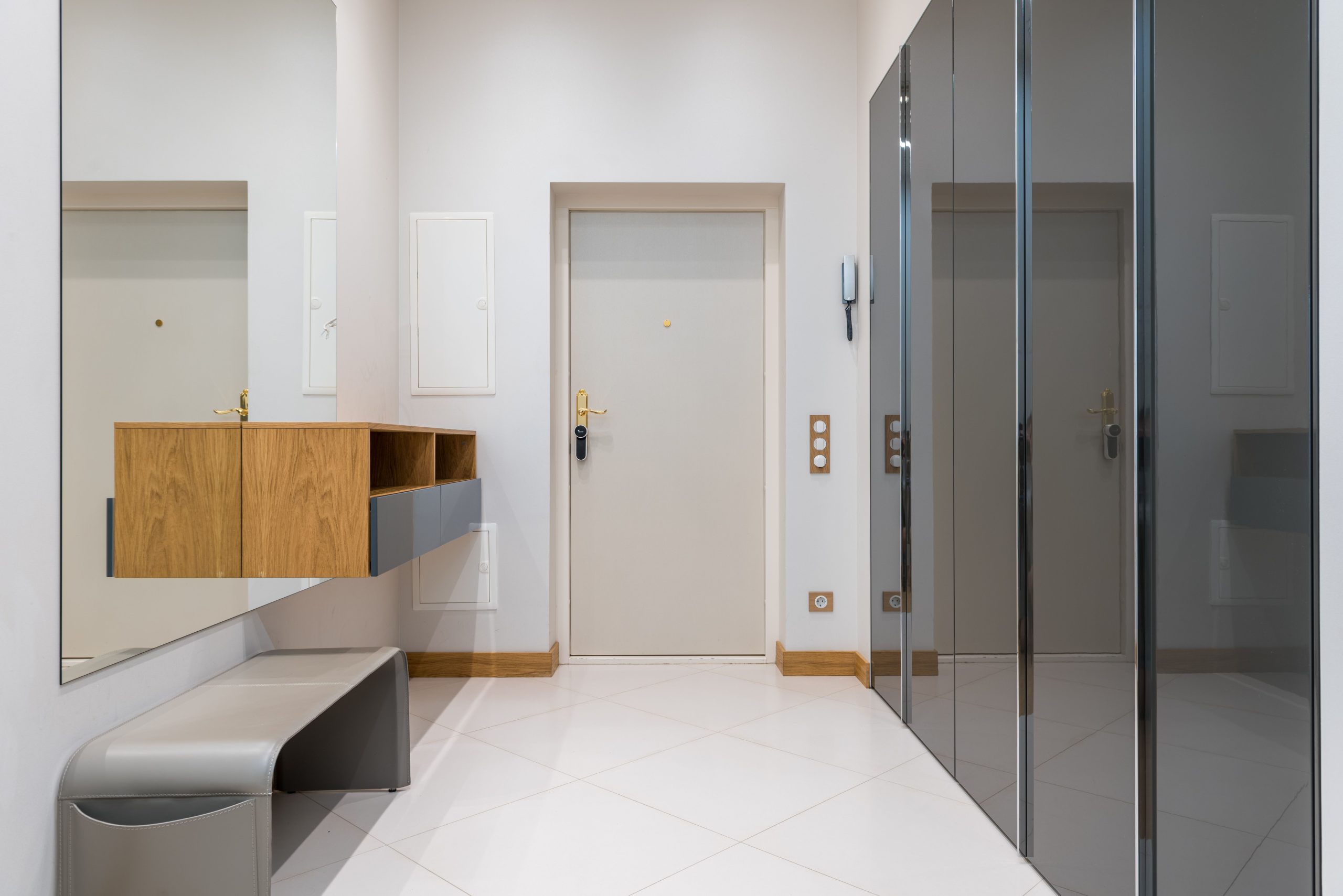
This floating console and bench combination is perfectly suited for a longer entryway that is 5-7 feet wide. The floating console (typically 12-14 inches deep) and the slim bench maintain a wide, clear path for walking. Critically, you need a wall at least 8 feet long to allow for visual breathing room around both the mirror and the console. Placing a large mirror and furniture on a wall that’s too short will make the area feel cramped and cluttered, defeating the purpose of the minimalist design. It is a more open version of the storage seen in Idea #22.
27. A Warm, Traditional Entryway with Light Yellow Walls
This entryway feels so warm and welcoming due to its commitment to a traditional, sunny palette. The light, buttery yellow on the walls instantly creates a cheerful and inviting atmosphere. This is a classic choice that pairs beautifully with the crisp white trim and doors, a combination that always feels fresh. The warmth is further enhanced by the wooden base of the sink cabinet and the rusty red tones in the floral rug. It’s a space that doesn’t follow fleeting trends, but instead relies on timeless elements that evoke a feeling of home.
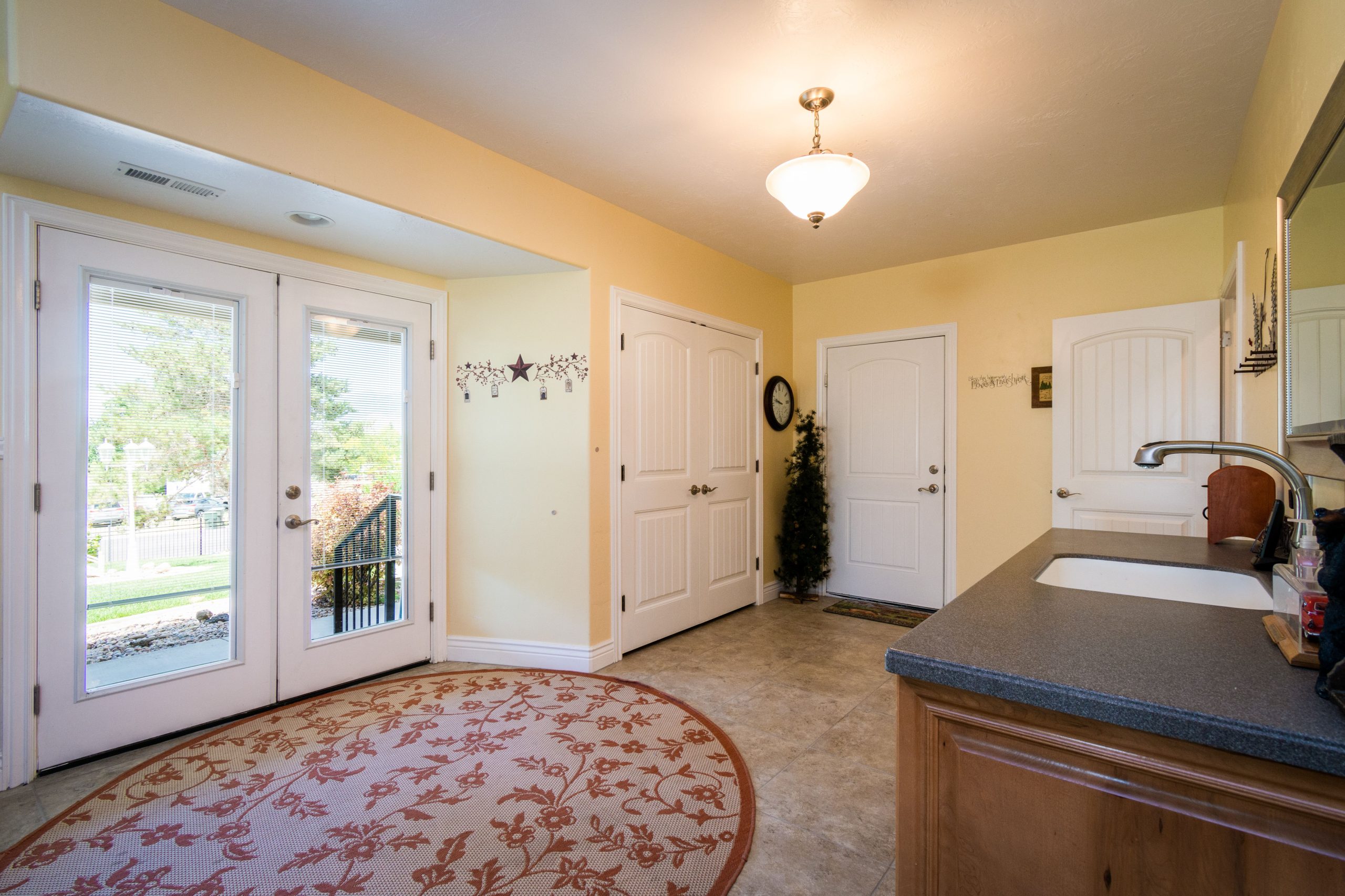
In a world dominated by gray and white interiors, a turn back toward warm, soft colors like this light yellow feels both nostalgic and fresh. This look taps into the “Grandmillennial” or “Modern Traditional” trend, which celebrates classic design elements—like floral rugs, paneled doors, and warm color palettes—but uses them in a way that feels clean and uncluttered. It’s a reaction against years of stark minimalism, showing a renewed appreciation for spaces that feel layered, personal, and genuinely comfortable rather than staged.
28. A Modern Entry with a Slatted Wood Wall and Storage Bench
When integrating a storage bench with a slatted wood feature wall, the key to a seamless look is proportion. The height of the cushioned bench should align perfectly with a horizontal line in the architecture—in this case, the bottom of the front door’s lowest panel. This creates a clean, intentional sightline that makes the separate elements feel like a cohesive unit. For the slat wall itself, using a 1.5-inch slat with a 0.75-inch gap is a classic ratio that provides texture without looking too busy. A similar slat wall is also shown in Idea #10.
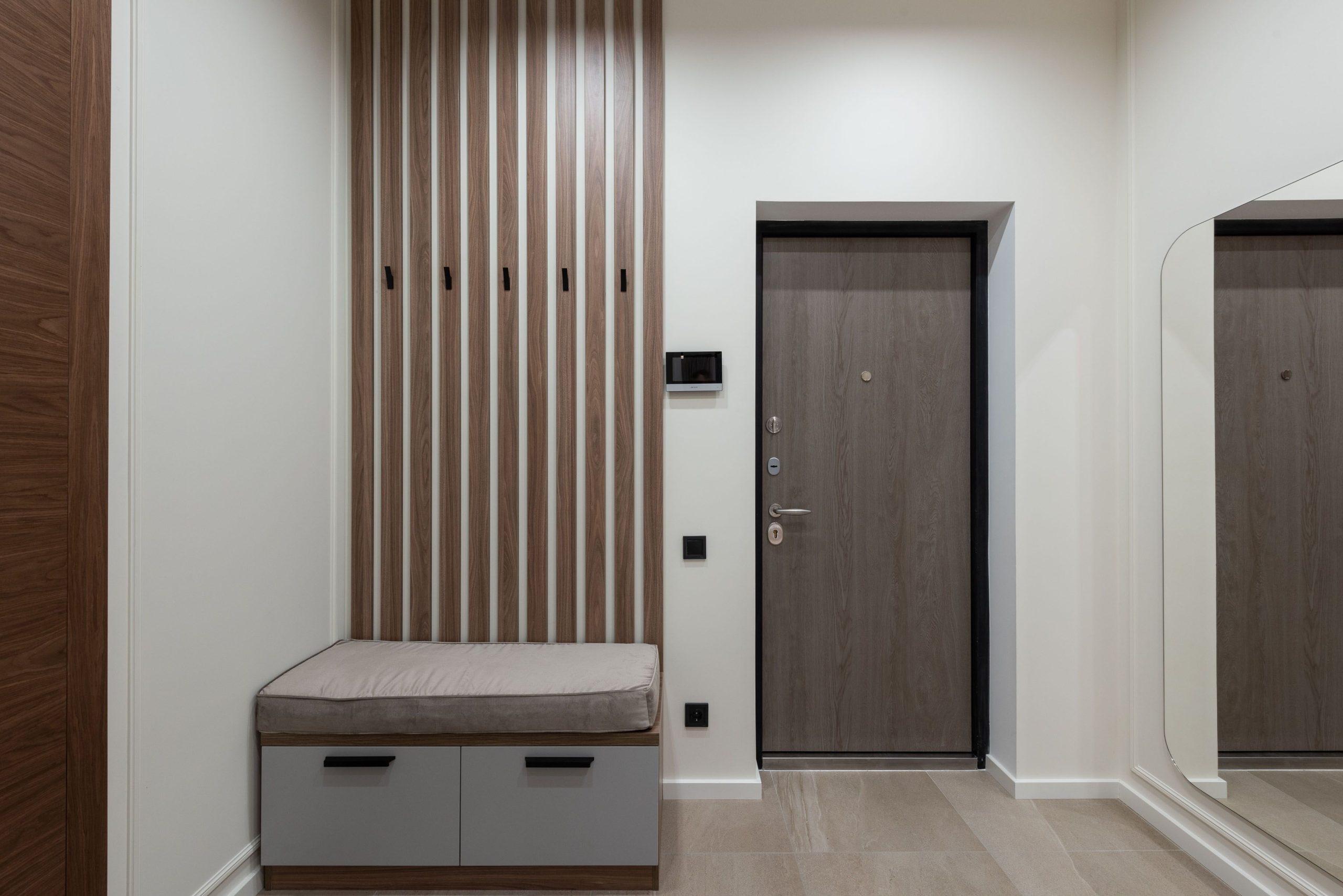
A light gray fabric cushion on an entryway bench is a chic choice, but it requires some practical considerations. An entryway is ground zero for dirt, rain, and snow. To protect your investment, treat the cushion fabric immediately with a heavy-duty fabric protector spray, like Scotchgard, and plan to reapply it every 6 months. For an even more durable solution, have the cushion made with a removable, zippered cover from a performance fabric (like Sunbrella) that is machine washable. This will make inevitable clean-ups a simple task rather than a major headache.
Your Tidiest, Most Welcoming Entry Awaits
That first step into your home should feel good. It should be a moment of calm, not chaos. Don’t feel like you have to tackle a huge renovation all at once. Start with one idea—a new rug, a better set of hooks, a can of paint for the door—and see how it transforms the space. Your perfect entryway is waiting for you, one small, smart decision at a time.
When you’re ready to start your project, your inspiration board on Pinterest will be waiting for you!